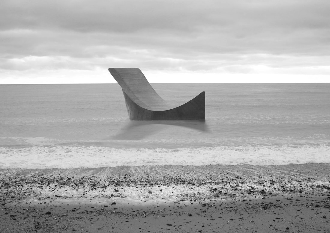
SPATIAL
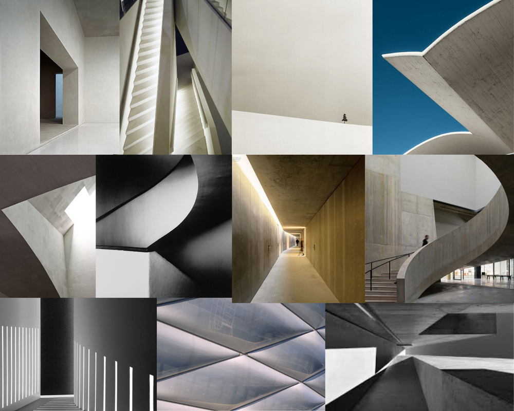
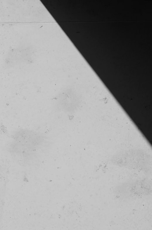
My first idea for the exam title 'Spatial' is to create a visual mood board so that I can start thinking of potential ideas for ways in which I can develop this project. By creating this mood board, it has already started to plant ideas in my mind. For example, I am considering the idea of negative space and also architectural spaces and how light interacts with the spaces.

Mind map
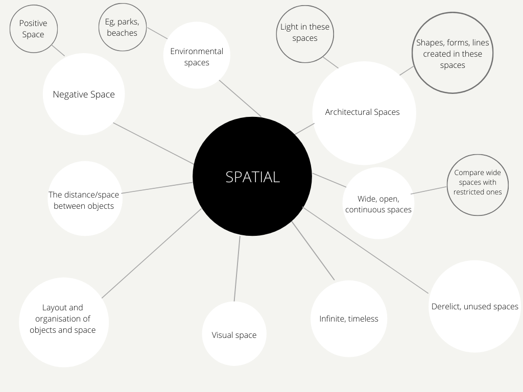
I have also created this mind map to get all my ideas written down into one place. I will be continuously referring back to this, adding any new ideas I think of and also to inspire me with my responses.
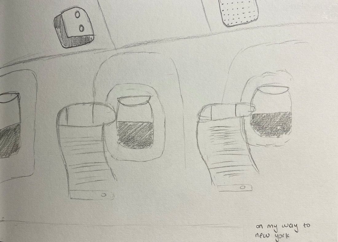
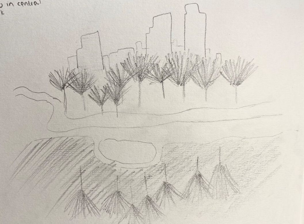
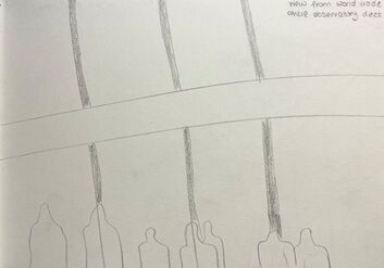
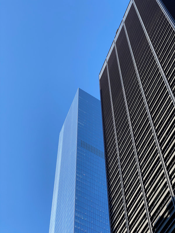
New York trip
My sketches
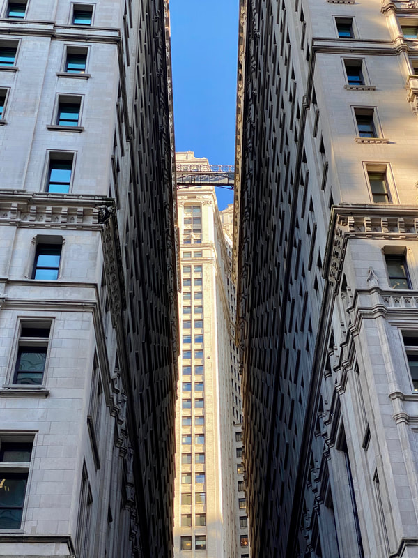
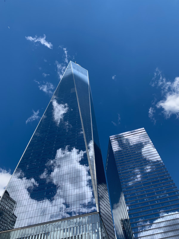
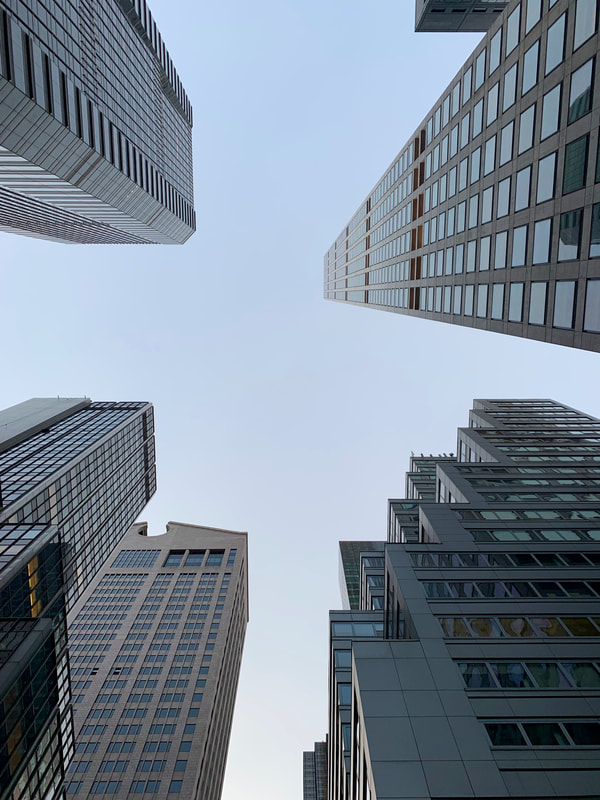
I was able to go on a trip with my photography class to New York, which was a perfect opportunity to begin thinking about my three different strands that I will have to come up with in relation to the theme: Spatial. I decided to not only photograph there, but to also sketch different things I saw. By doing this, I got to really focus and pay attention to the framing of my images. Before photographing, I would sketch my initial vision of what I wanted my image to look like, then I would actually bring it to life. I didn't want to worry too much about the details when I was sketching as I just wanted to get my overall vision on paper. Having my vision sketched out in front of me allowed me to make any changes when photographing my image. Even by drawing rough lines and shapes of things that I saw in front of me, I found that this helped me to explore different options I could possibly take with my chosen theme.
|
|
|
Best Images
|
|
|
|
|
|
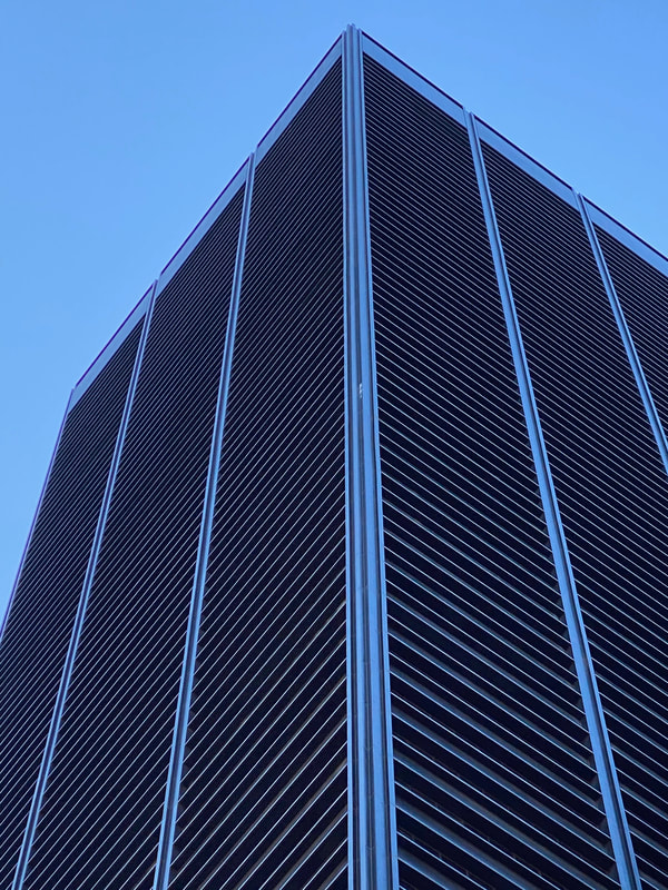
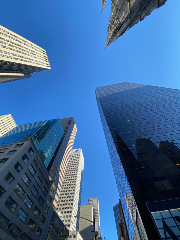
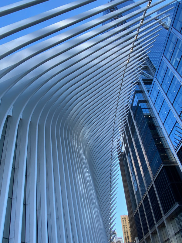
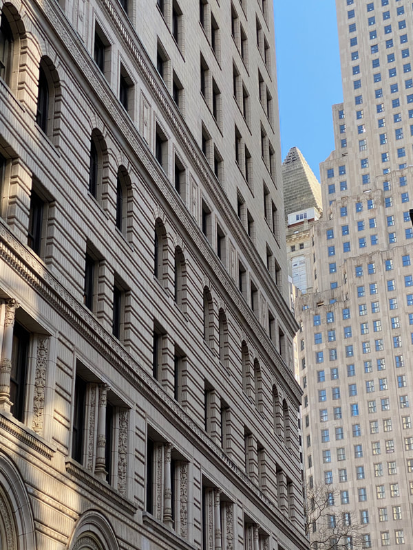
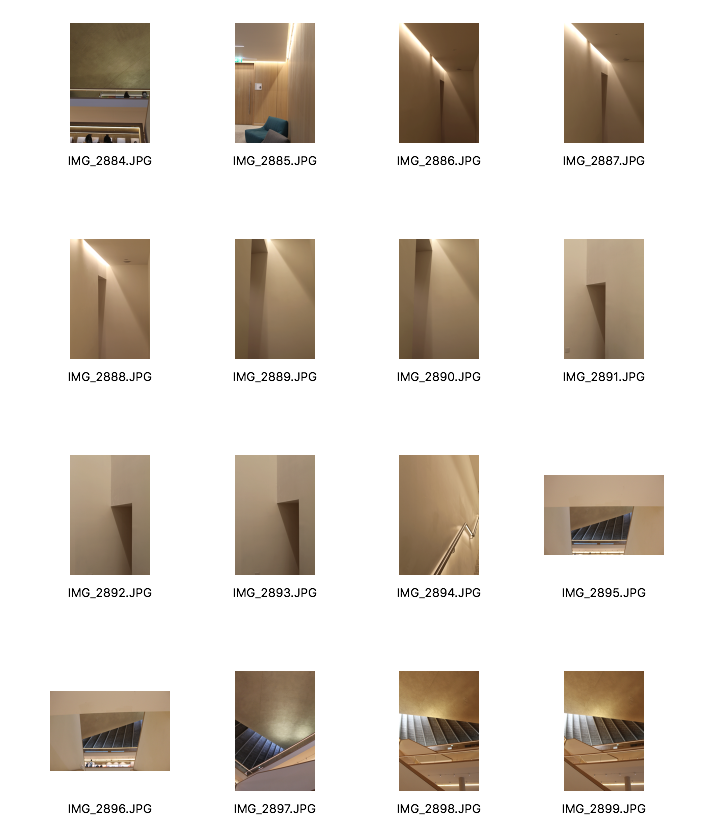
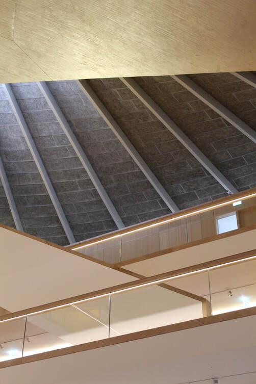
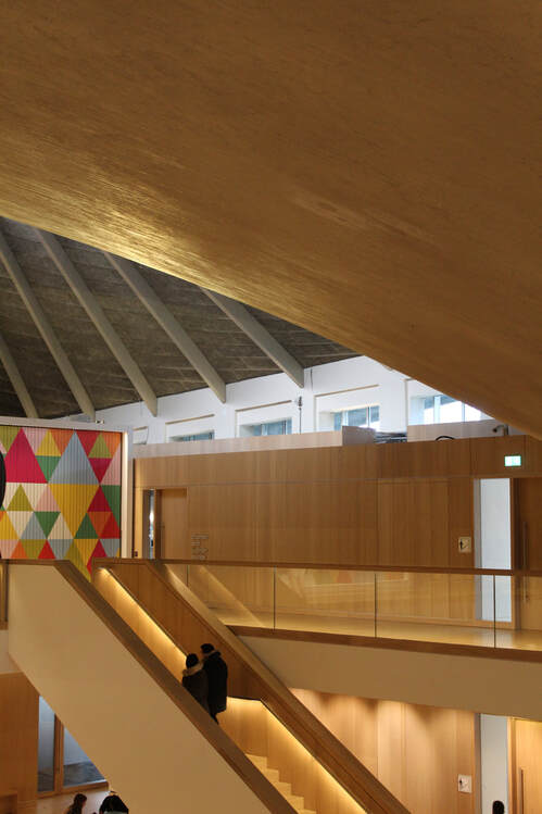
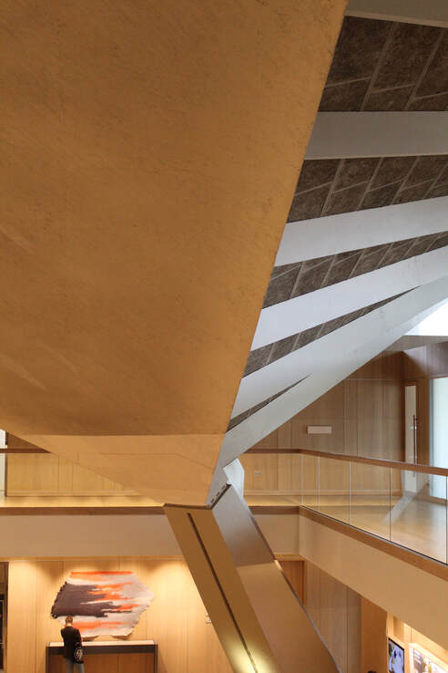
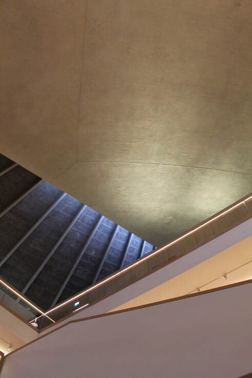
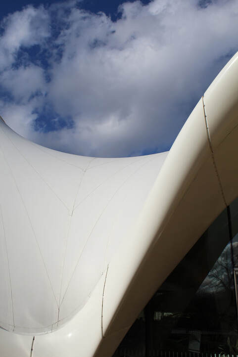
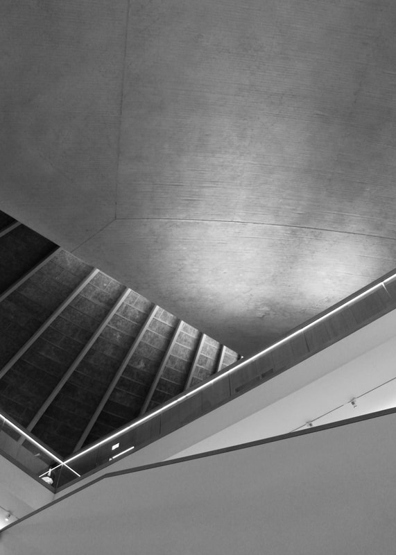
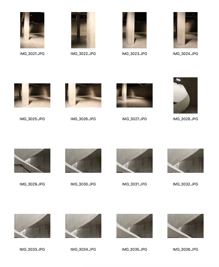
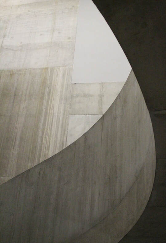
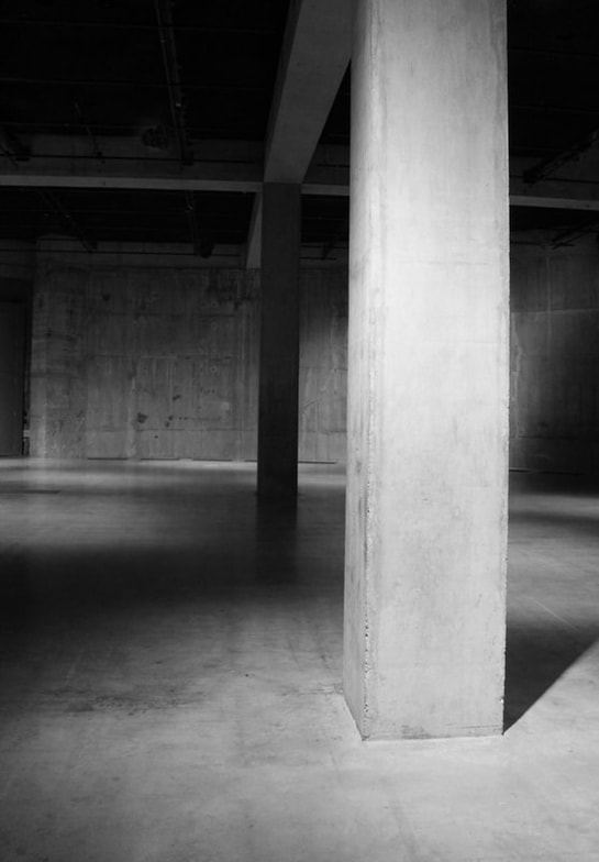
STRAND 1: Architectural Spaces
Roland Halbe
Roland Halbe is a German, architectural photographer and he has been working independently since 1988. Many of his images have been published in major architecture magazines such as Architectural Record, TASCHEN Books and many others. Even though he is not an architect, he likes to document built reality and the way architecture reacts with its surroundings, light, people and geometric forms. Before completing his projects, he moves in and around of the building, focusing on the light and life of it. It can take him two or more days to do this depending on the size and complexity of the project. He also the architect who designed the buildings to give him a tour so that he learns more about it. This gives him a deeper understanding and familiarity of the buildings so that when he does eventually photograph them, he already has a precise picture of what areas he wants to photograph. Below, I have created two slideshows, showing two of his projects: National Museum of Qatar, 2019 and Business School, 2019.
In response to Halbe's work, I am planning to visit two locations in London: The Design Museum and the Serpentine Sackler Gallery. Before going to these locations, I am going to do some research on their architecture so that when I do go, I already know what areas of the building I would want to photograph.
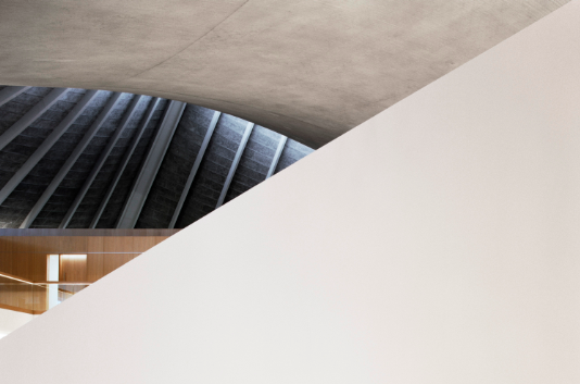
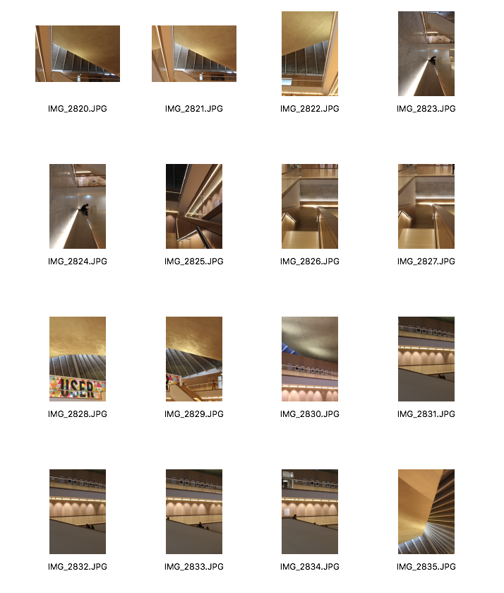
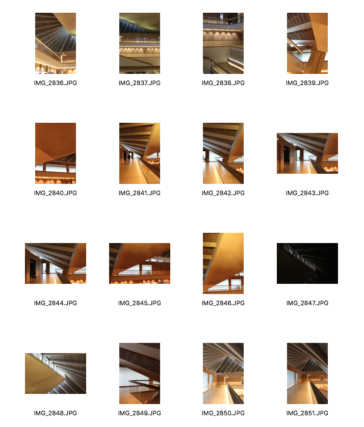
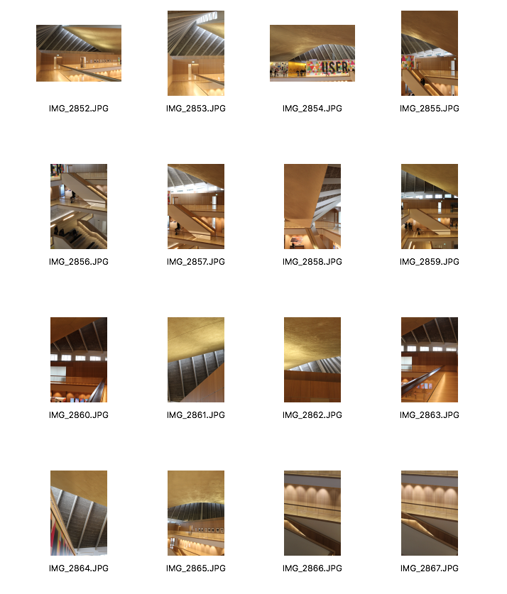
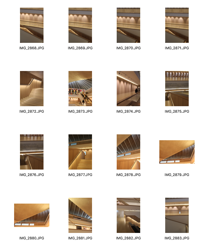
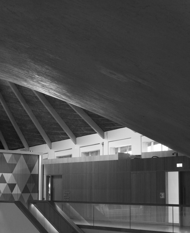
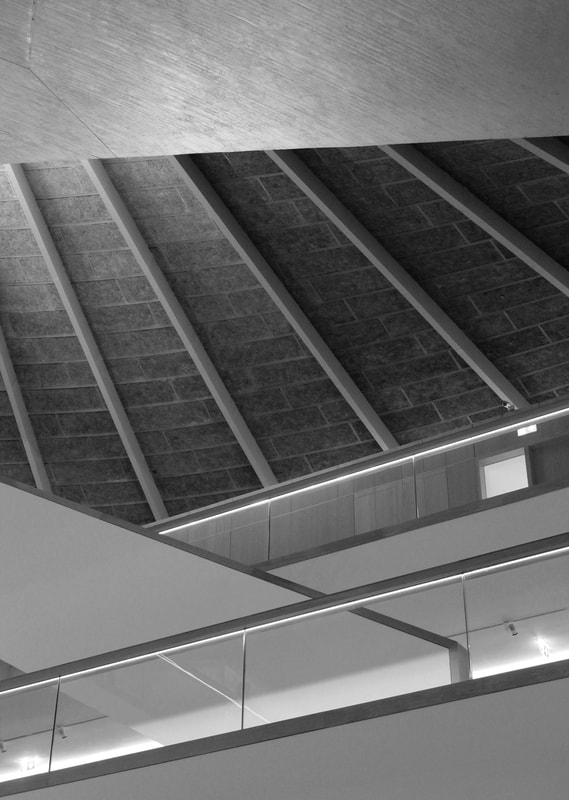
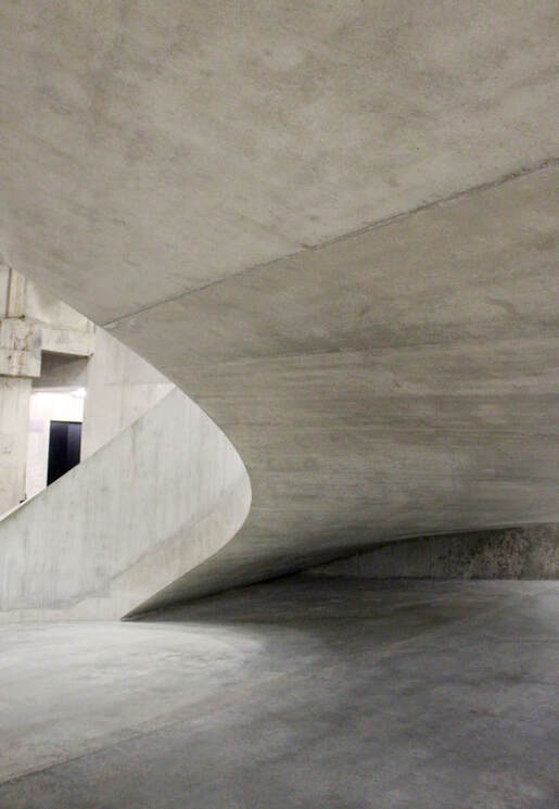
First Location: The Design Museum
|
The first location I am planning on visiting is the Design Museum, located in Kensington High Street. OMA with Allies and Morrison were responsible for the architecture for this museum, whilst architect John Pawson was responsible for the interior design. Pawson's work is known for its minimalistic aesthetic and simplicity in form.
|
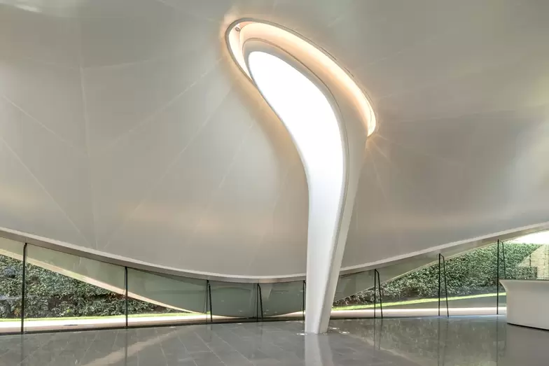
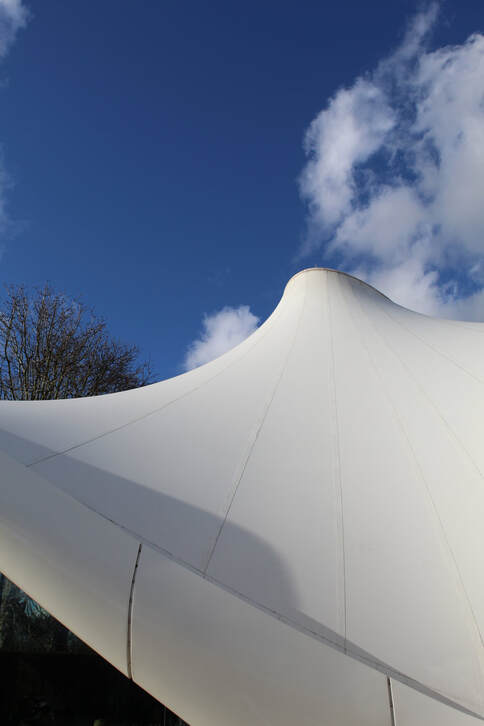
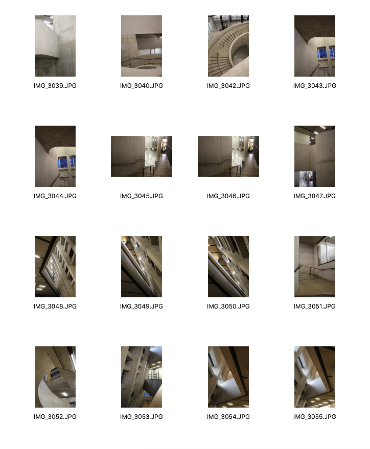
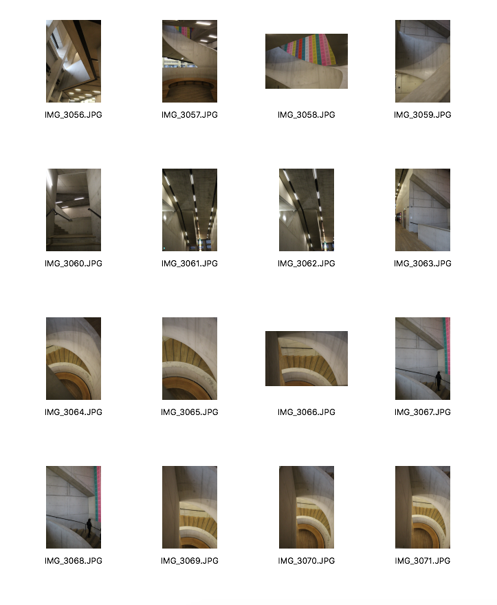
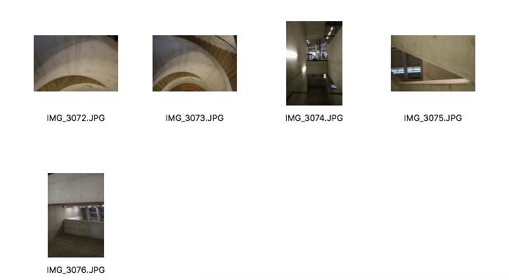
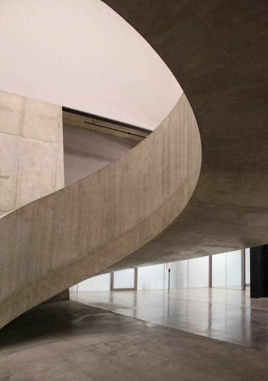
Second location: Serpentine Sackler Gallery
|
The next location I am planning on visiting is the Serpentine Gallery in Hyde Park. Architect Zaha Hadid designed a new light and transparent extension for this gallery. It has been designed to complement the calm neo-classical architecture of the original building.
|
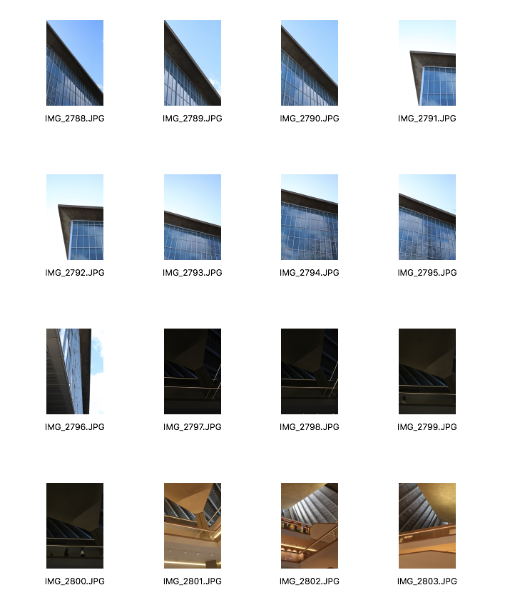
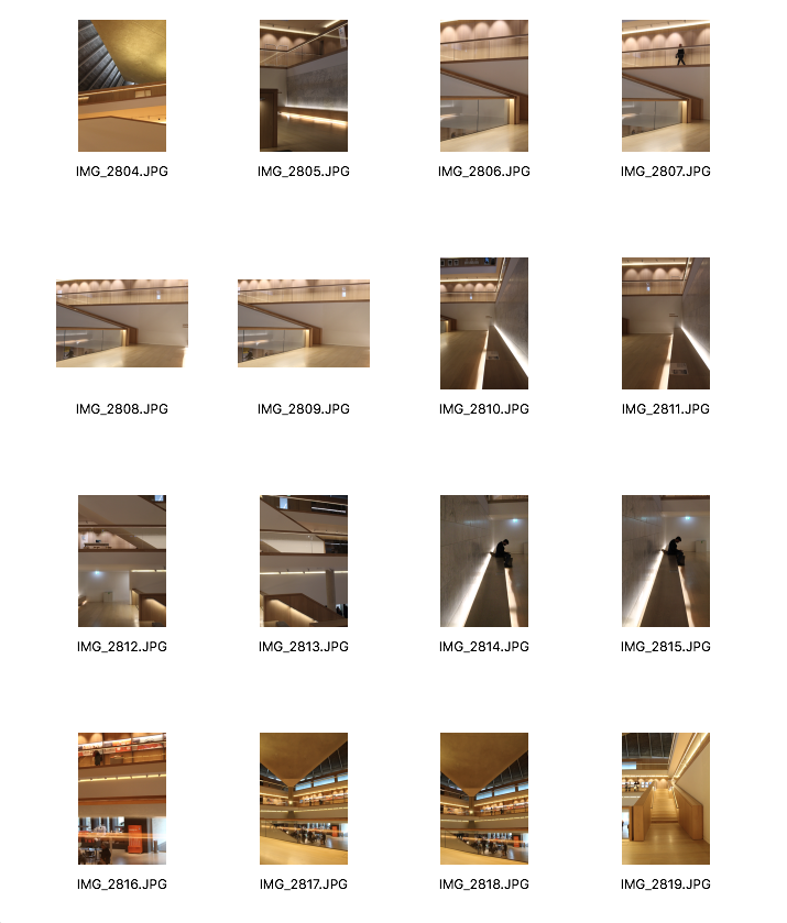
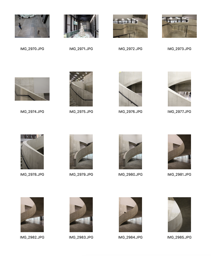
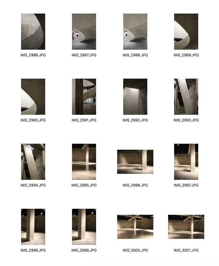
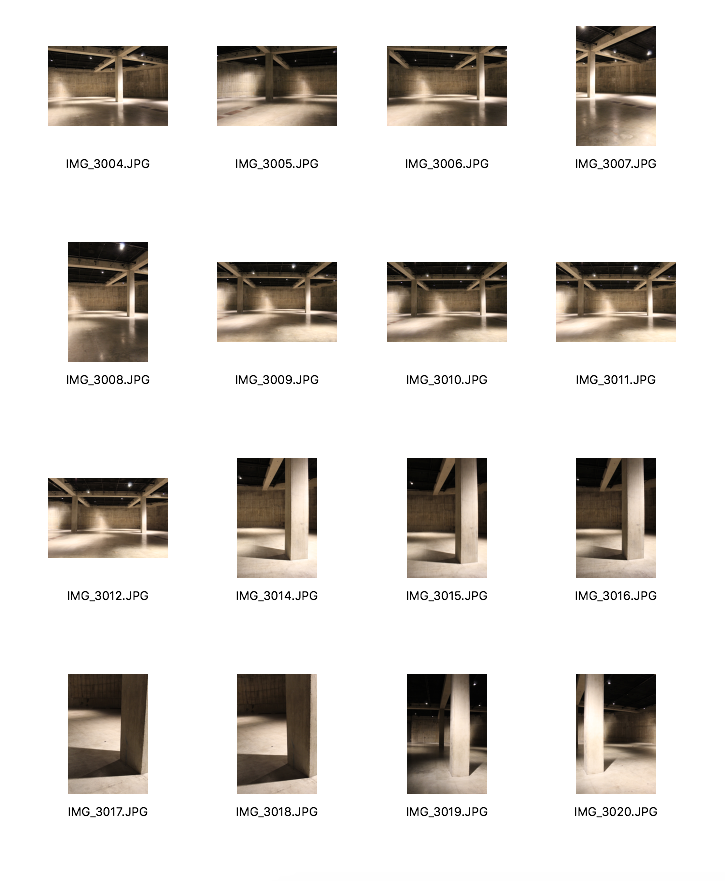
Contact Sheet
|
|
|
|
|
|
|
|
|
|
Best Images: Unedited
|
|
|
|
|
|
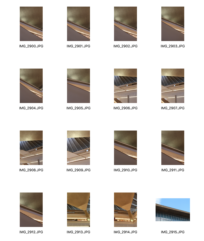
Editing on Photoshop
Below, I have illustrated each step of how I edited my images on Photoshop:
1. I opened up my selected image
2. I then went to Image > Adjustments > Black & White
3. In order to crop my image, I selected the 'Rectangular Marquee Tool' on the left side bar, and selected the area of my image which I wanted to crop
4. Then, I went to Image > Crop
5. Finally, I went to Image > Adjustments > Brightness/Contrast to adjust these
Best Images: Edited
|
|
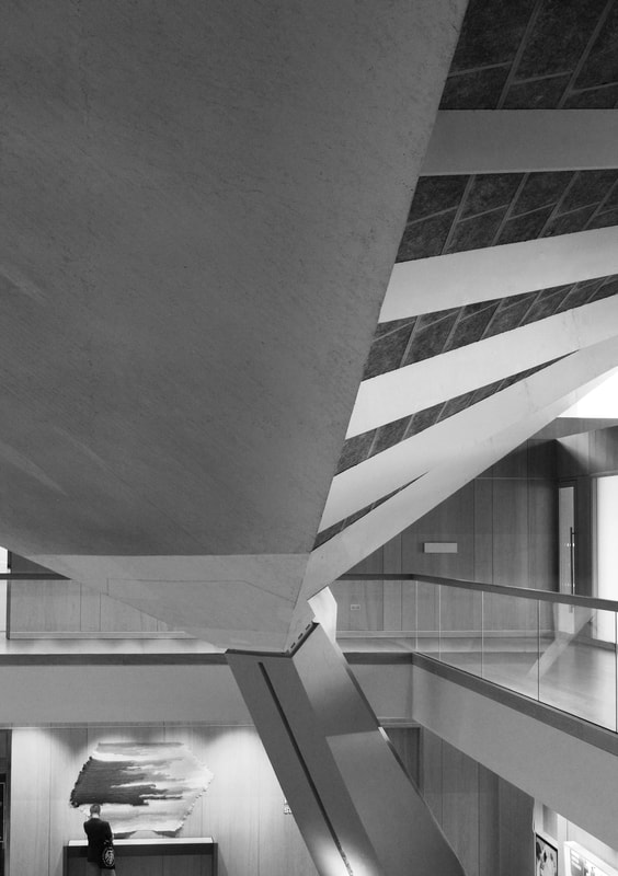
I decided to edit my images into black-and-white because I felt as though the structures and shapes that I photographed in the museum looked more isolated when they were black and white. I also realised that when I edited my images, the contrasts between light and shadow were emphasised. Also, looking back at my original images from the Design Museum, the lighting seems to be quite yellow which was another reason why I decided to edit them into black-and-white. What I particularly liked about my images is that I like the way I used the different structures to frame my images. If I were to carry on exploring this strand of 'Architectural Spaces',
As this is only my first strand and I am still exploring different ideas relating to the theme of 'Spatial'
As this is only my first strand and I am still exploring different ideas relating to the theme of 'Spatial'
STRAND 2: Negative Space
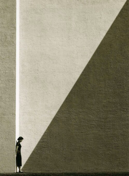
Fan Ho
Fan Ho was born in Shanghai and started his photographic career at the very early age of fourteen. Many of his famous images were captured with his twin lens Rolleiflex. Many of Ho's images were unexpected and not planned but very well composed, paying close attention to geometric shapes, patterns and texture. Ho is known for his famous black and white street photography but as I was looking through these images, I noticed his use of negative space. Below I have included two images where negative space plays a role.
Into the Mist, 1955
|
Approaching Shadow, 1954
|
Contact Sheet
|
|
|
|
|
|
Best Images: Edited
|
|
|
|
|
|
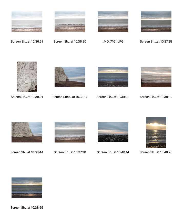
STRAND 3: Environmental Spaces
Noemie Goudal
French artist, Noemie Goudal studied Photography at the Royal College of Art and Graphic Design at Central Saint Martins. She works between Paris and London. Below I have included some of her images from her series 'Observatoires' and 'Haven Her Body Was'. For her series, she had collected many images that she had taken when travelling of fragments of many buildings. Then afterwards, she would put these different fragments together on her computer and print them on paper. These architectural elements are seamlessly placed against empty beaches or stretches of desert. The concrete structures seen are, in fact, paper backdrops which she has cut out from photographs of real buildings which have then been mounted onto cardboard. She first constructs these paper backdrops in the studio and then shoots them in natural locations. them shows isolated architectural buildings in quiet landscapes. What is interesting about her work, is the way she uses traditional photographic techniques but also combines this with physical manipulation to create these imagined architectural spaces.
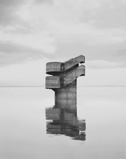
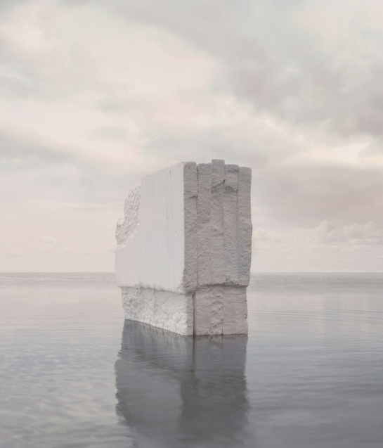
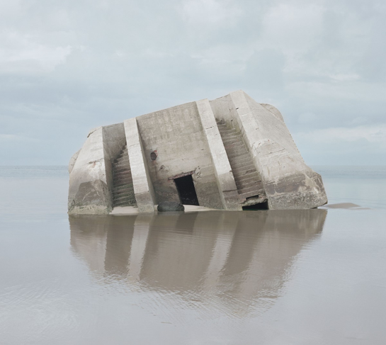
The second image from her series 'Haven Her Body Was'. When looking at this image, the viewer may think this is another one of her paper backdrops but, in fact, it is real. It is a WWII bunker that she found in Normandy, France. By photographing this bunker, it made her research geomorphic architecture, which is architecture that links to nature in order to imitate or draw our attention to it. This then led her to begin researching the architecture of observatoires which eventually led to her series 'Observatoires'.
The second image from her series 'Haven Her Body Was'. When looking at this image, the viewer may think this is another one of her paper backdrops but, in fact, it is real. It is a WWII bunker that she found in Normandy, France. By photographing this bunker, it made her research geomorphic architecture, which is architecture that links to nature in order to imitate or draw our attention to it. This then led her to begin researching the architecture of observatoires which eventually led to her series 'Observatoires'.
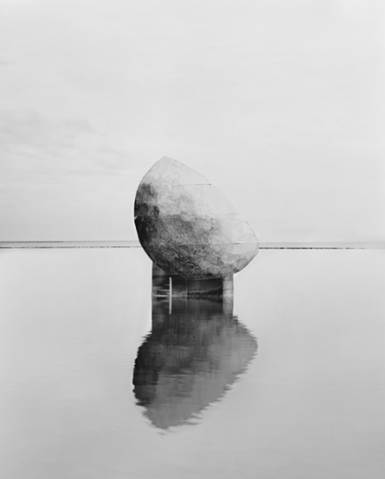
'Observatoires' series
|
'Observatoires' series
|
'Haven Her Body Was'
|
Combat 2012, from 'Haven Her Body Was'
|
My response
For my response, I am planning on going to Brighton to photograph the sea so I can use these images as a background for when I edit buildings into the sea. I am also going to photograph natural landscapes in London like large parks, for example Hampstead Heath and Hyde Park. By photographing the beach and the green spaces, I will have two different locations in which I can photoshop my images onto. I am going to use my images from my previous shoots of buildings and structures. Even though Goudal's buildings are actually paper structures, I have decided to attempt responding to her work using photoshop.
Contact Sheet
|
|
|
|
Editing process
In order to create a similar effect to Goudal's work, I decided to use photoshop to edit fragments of my building images into my images of my environmental landscapes (the sea and the park). I first used one of my images from my Tate Modern shoot and one of my images of the sea in Brighton. Below, I have uploaded a slideshow and a detailed description of each step I went through in order to create my first response.
1. Firstly, I opened up the two images I wanted to use
2. Then I selected the 'Quick Selection' Tool on the left side bar and selected the area of the building I wanted to use
3. After that, I pressed 'cmd' > 'C' to copy the area I selected and I pasted it onto my image of the sea
4. I then pressed 'cmd' > 't' to transform my image so that it was placed in the right position in the sea
5. I had to erase parts of the image of the building as there were some areas that had been selected by the quick selection tool which I did not need. I erased these areas by selecting the 'Eraser Tool' on the left side bar.
6. I wanted to make my image look as realistic as possible so I decided to add a reflection in the sea. I pasted the same image of my building again onto the image of the sea and selected free transform again to put it in the right place
7. When I selected free transform, I right clicked so that I had the option to flip my image vertically (Flip Vertical).
8. After that, I went to Filter > Blur > Motion Blur so that the reflection looked more realistic
9. I then wanted to erase the very sharp edges of the building to make it more seamless
10. Lastly, I wanted to make my image black and white so I selected each layer and went to Image > Adjustments > Black & White
Outcome
This was my first response to Noemie Goudal's work and I think it was quite successful and it looks quite realistic. I like how the reflection I added makes it really look like a fragmented building is floating in the sea. The only thing I was concerned about whilst editing this image on photoshop, was the way the image I decided to use had quite sharp edges which made it look quite harsh against the background. To overcome this issue, I tried using the erase tool to smooth the edges and the result was successful, however, it would have been even better if I had used a fragment of a building which had curved edges. Next, I am planning to carry on experimenting with photoshop and editing my images of buildings into natural landscapes, however, I am going to try and respond to another one of Goudal's series; Soulevements. I will be using the same technique and process that I used in this response, but I will be fragmenting different buildings that I photographed, to create an almost abstract building, made up of different parts.
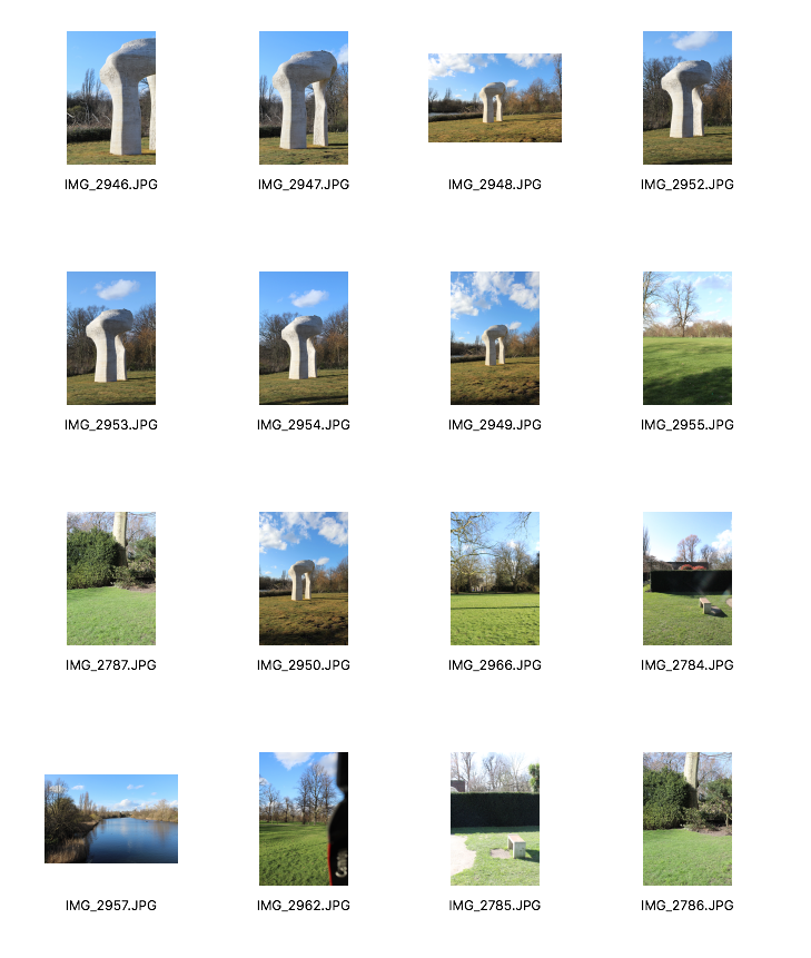
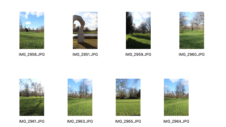
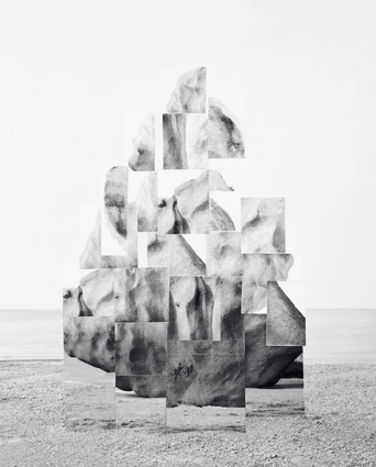
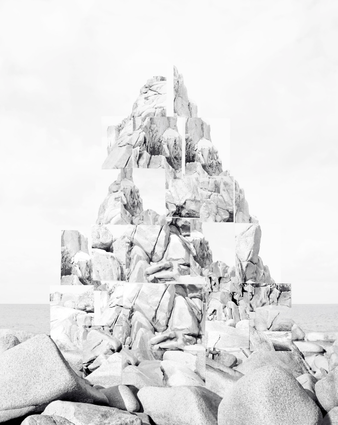
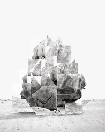
Series: Soulevements, 2018 by Noemie Goudal
I have decided to look at another one of Goudal's series called 'Soulevements'. In this series, she didn't use paper backdrops like she did in her other series, instead she used around 25 mirrors stacked on top of each other that all reflected one part of a rock. Each mirror is slightly tilted so they reflect the rock in a sort of cubist way. In terms of my response, I am planning to use different fragments from the different buildings I photographed to create these abstract sculptures on photoshop.
|
|
|
My response
Exhibition visits
The Photographers' Gallery: Jan Svoboda, Against the Light
I visited The Photographers' Gallery and saw an exhibition on Czech photographer Jan Svoboda. Presenting around fifty vintage works in original sizes and dimensions, 'Against the Light' marks the first major UK presentation of Svoboda, since his first solo exhibition in 1982. This retrospective exhibition offers viewers an insight into Svoboda's experimental approach to photography. Svoboda rejected established norms of photography in post-war Czechoslovakia and deconstructed the processes and forms of the medium. Svoboda sought to redefine the language of photography in relation to developments in painting and sculpture. Before becoming a photographer, he studied set design at the college of Applied Arts in Prague and did two years of military service, during which he wrote poetry inspired by Czech and French Symbolists. Soon after, he bought a camera and began experimenting with photography and used it as a way to illustrate his own poetry.
Picture Britain: Our People, Our Poverty
Another exhibition I visited was 'Picture Britain: Our People, Our Poverty' which reflects our social landscape today. It celebrates the resilience and strength of people swept into poverty, featuring 20 portraits and stories from across the country. The stories have been captured by Stephen Armstrong and the portraits were taken by award-winning photographer Jillian Edelstein.
NEXT DEVELOPMENT
Kate Jackling
Series: Blinded by The Light
|
|
|
My Response
|
|
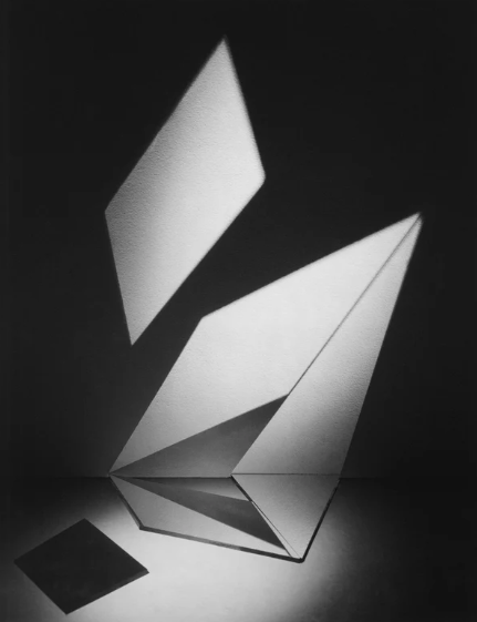
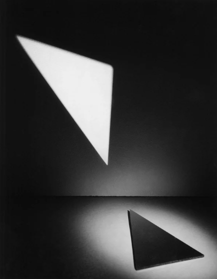
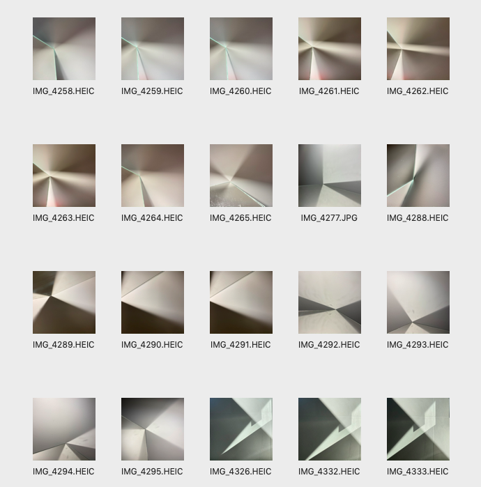
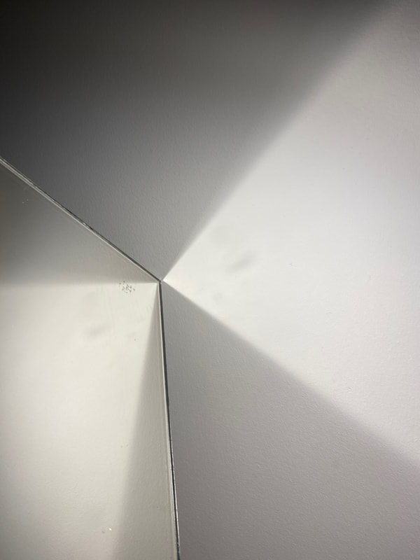
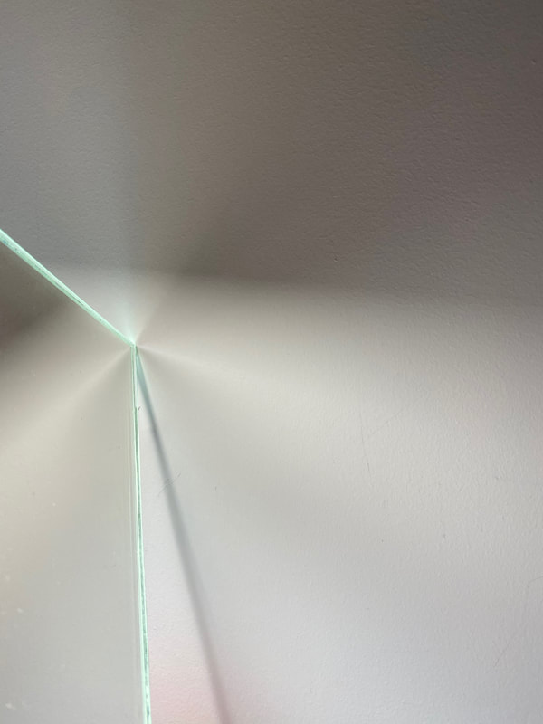
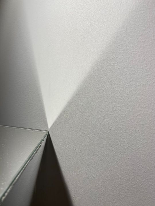
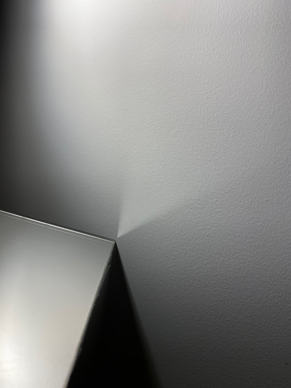
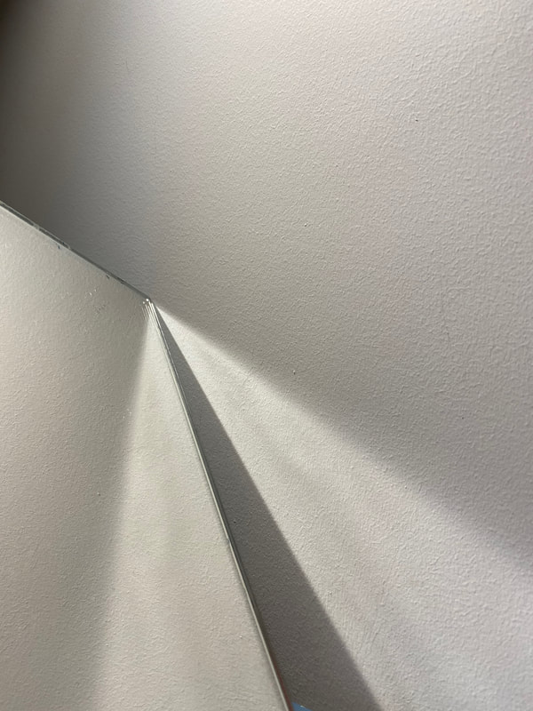
For my response to Jackling, I used a mirror to create light reflections on a wall. I used a strong light and positioned it in various ways, creating different shapes on the wall. I was constantly changing the positioning of the mirror as well. I really liked how strong shadows were created as well as light reflections. It almost made it looks as if I had cut up triangles and arranged them.
Best Images: Unedited
|
|
|
|
|
|
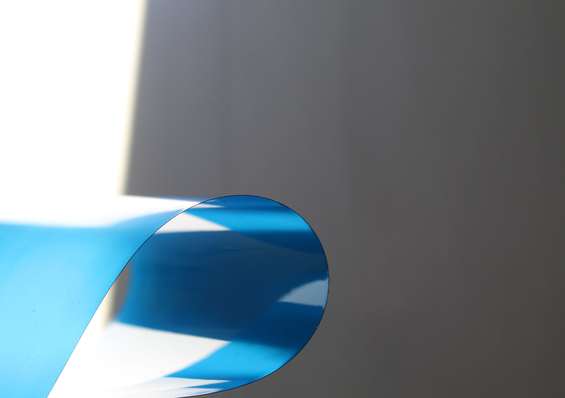
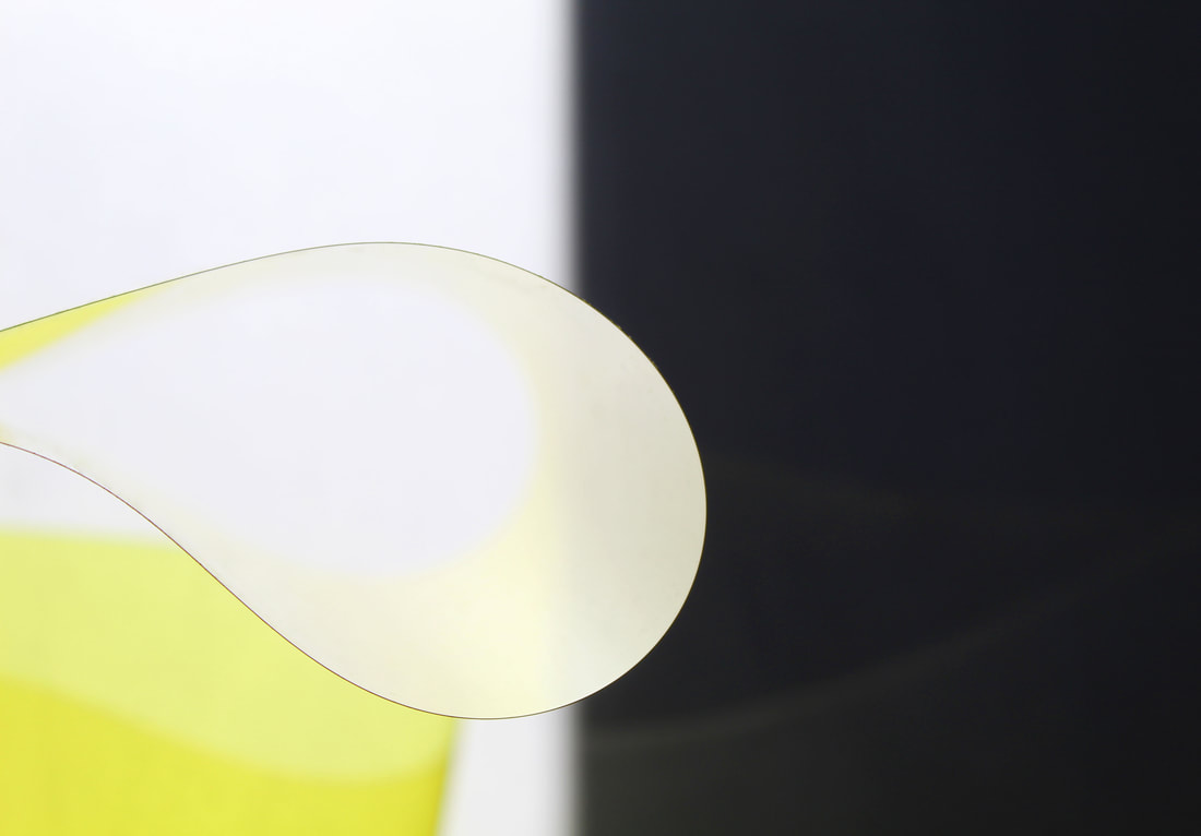
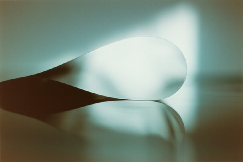
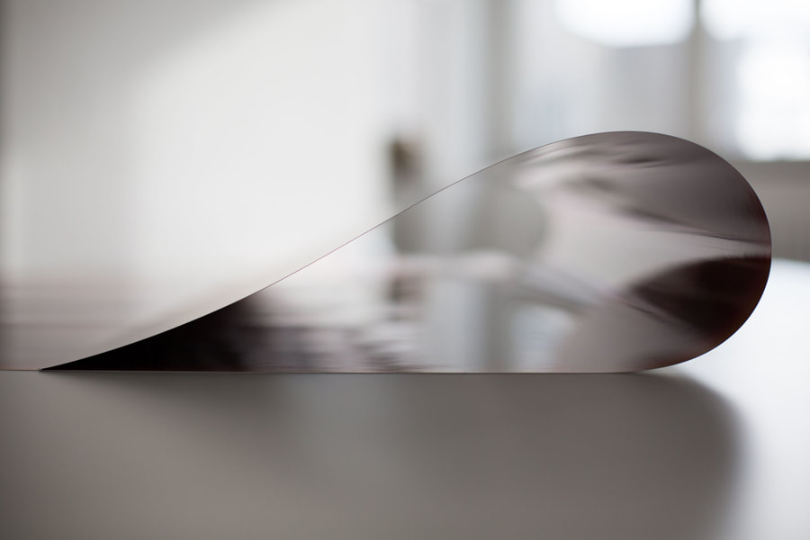
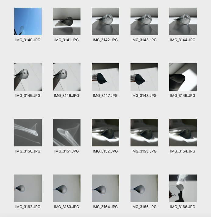
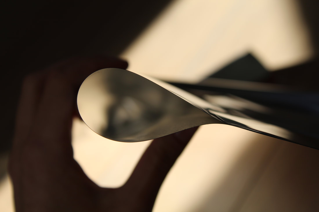
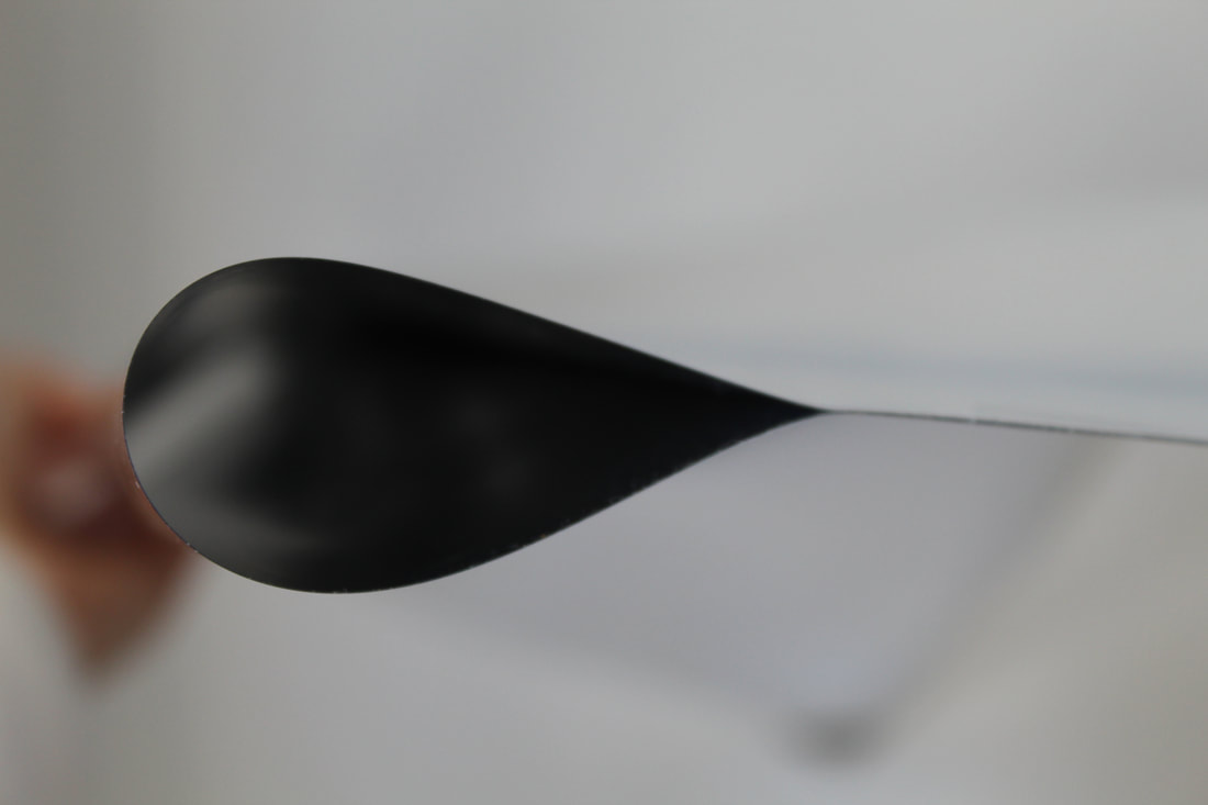
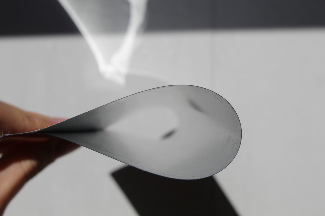
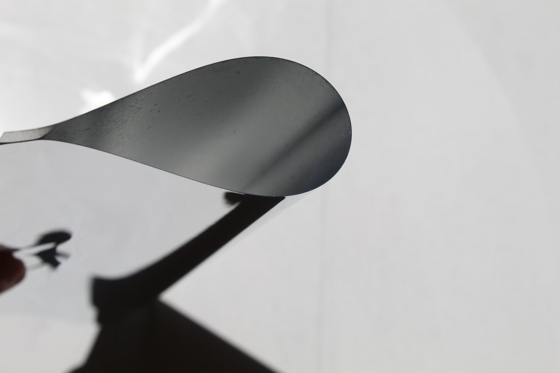
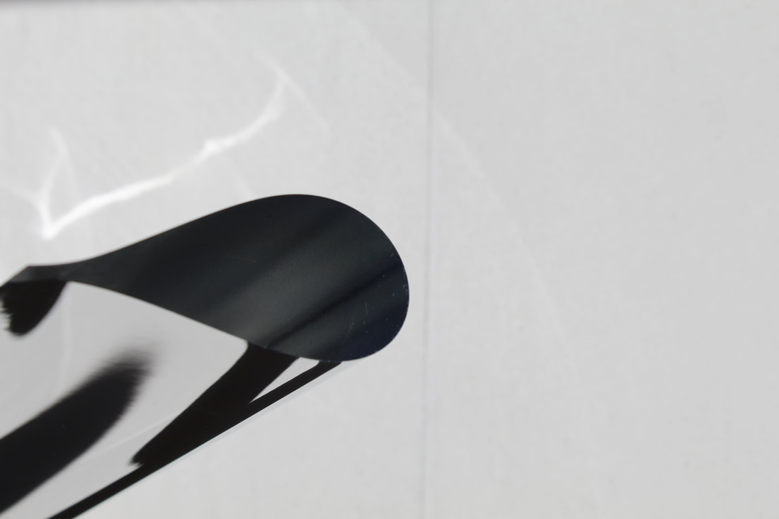
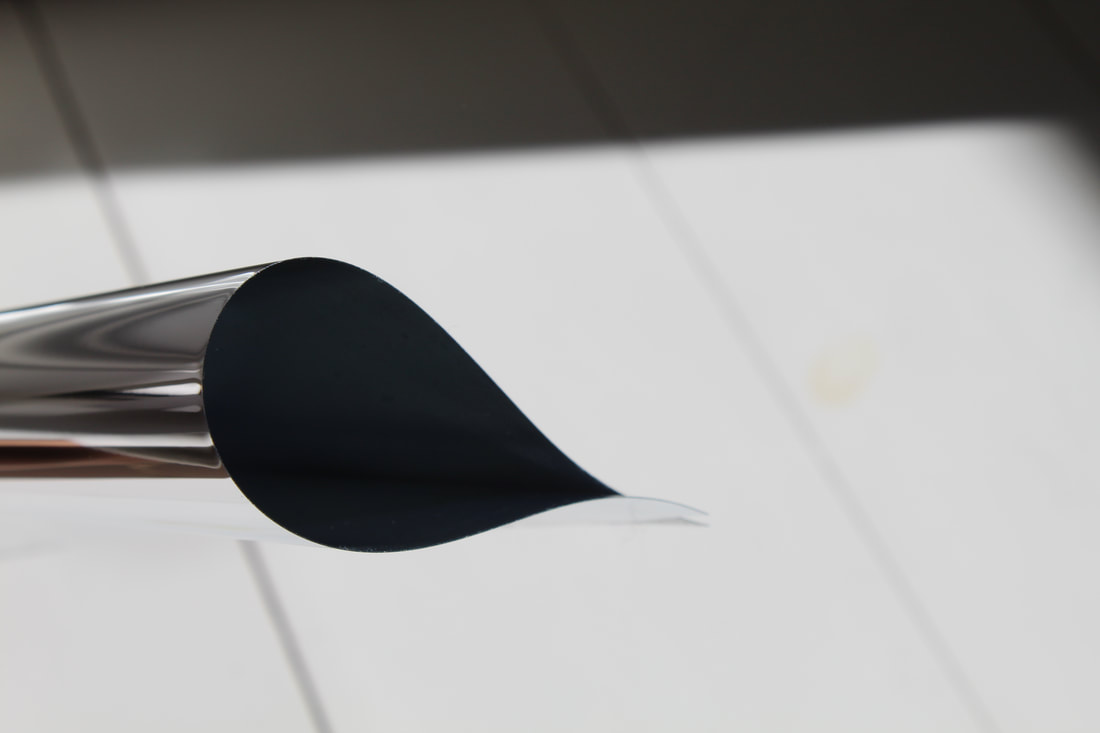
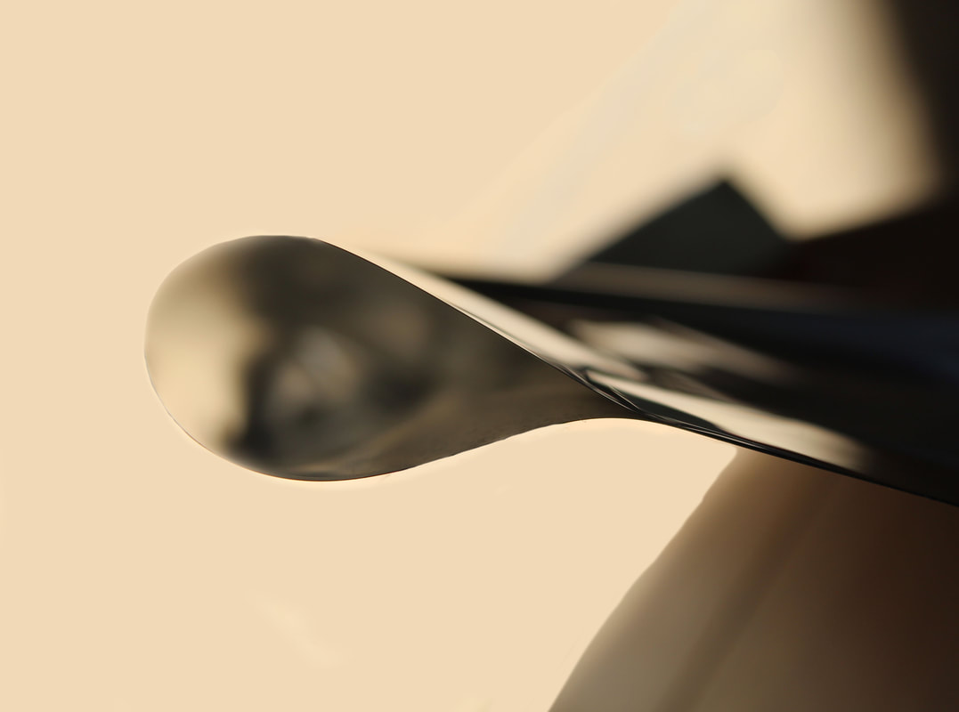
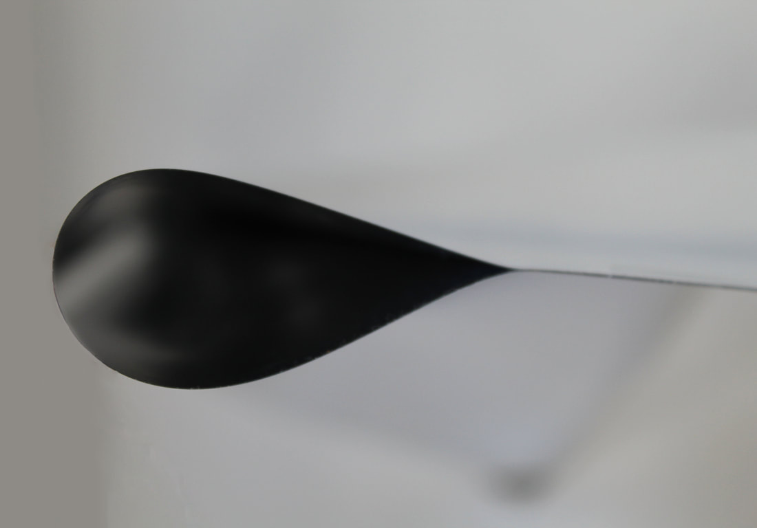
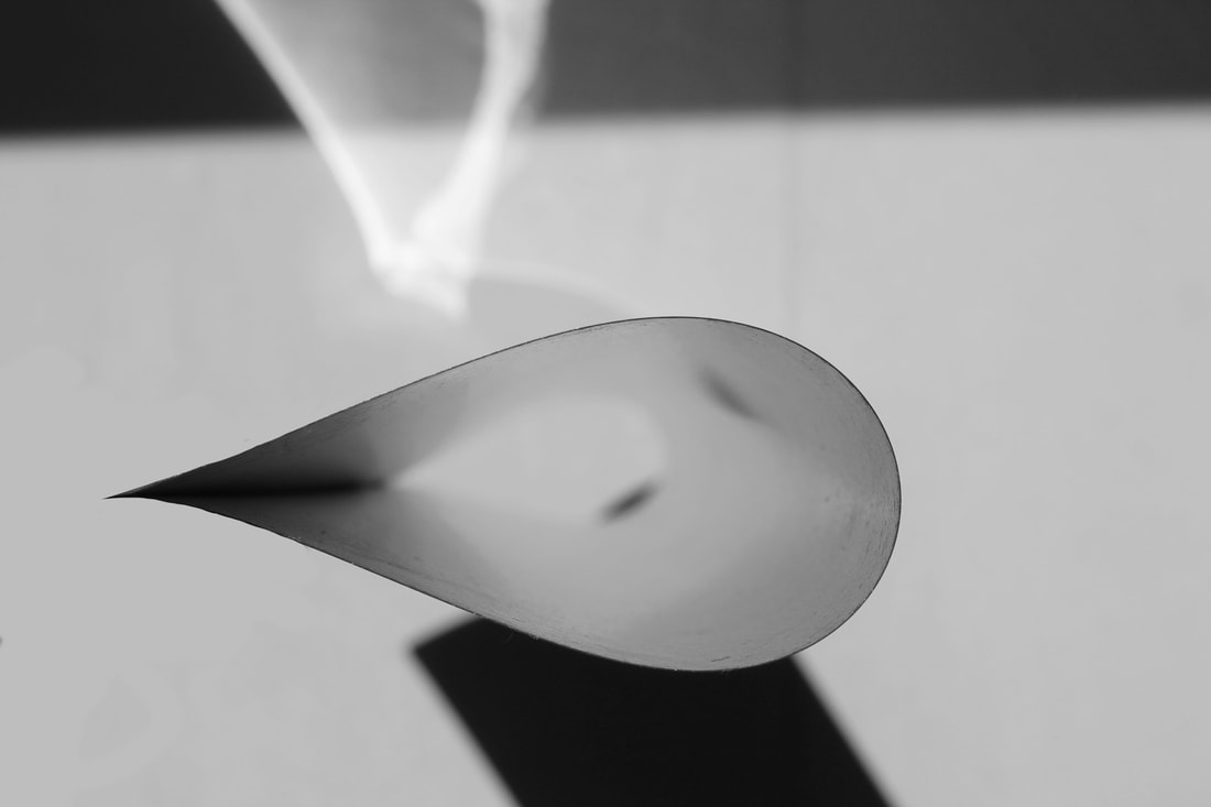
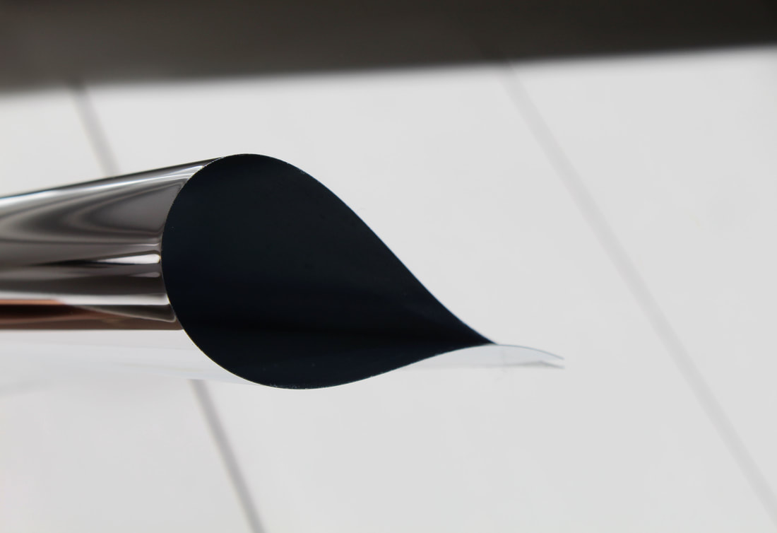
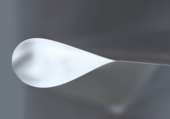
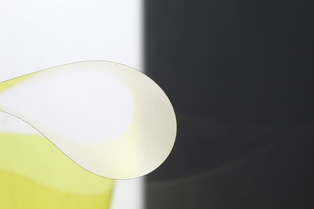
Wolfgang Tillmans
Wolfgang Tillmans was born in 1968 and is a contemporary German photographer. One of his series consisted of sculptural paper drops made of folded or rolled-up glossy photographic paper saturated with colour. The final images look very much like abstract paintings, but their slight folds and creases makes them almost sculptural.
"In my lens-based paper drop images I made the photographic paper itself my subject matter, creating images that are figurative and abstract at the same time. I liken them to mathematical functions. I can’t calculate them, but a mathematician could describe exactly how their shapes happened through the tension of the paper and gravity. They are almost like scientific illustrations.” - Tillmans
"In my lens-based paper drop images I made the photographic paper itself my subject matter, creating images that are figurative and abstract at the same time. I liken them to mathematical functions. I can’t calculate them, but a mathematician could describe exactly how their shapes happened through the tension of the paper and gravity. They are almost like scientific illustrations.” - Tillmans
|
|
My Response
|
|
|
|
Best Images: Unedited
|
|
|
|
|
|
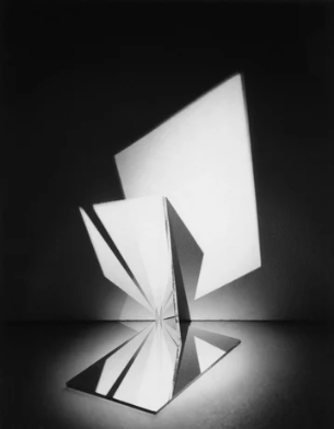
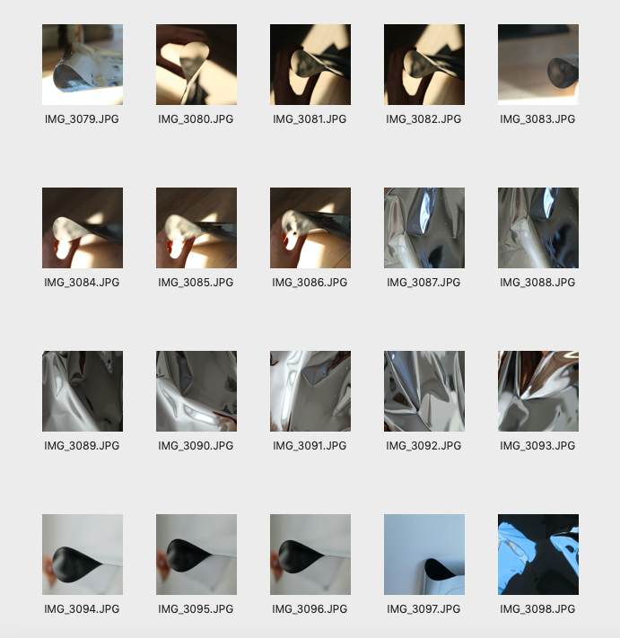
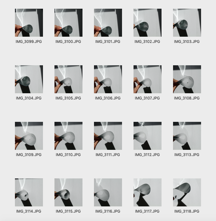
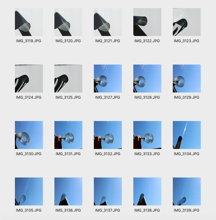
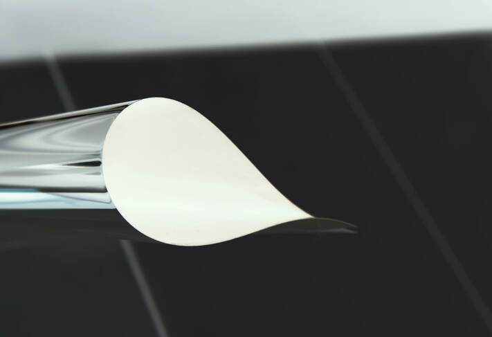
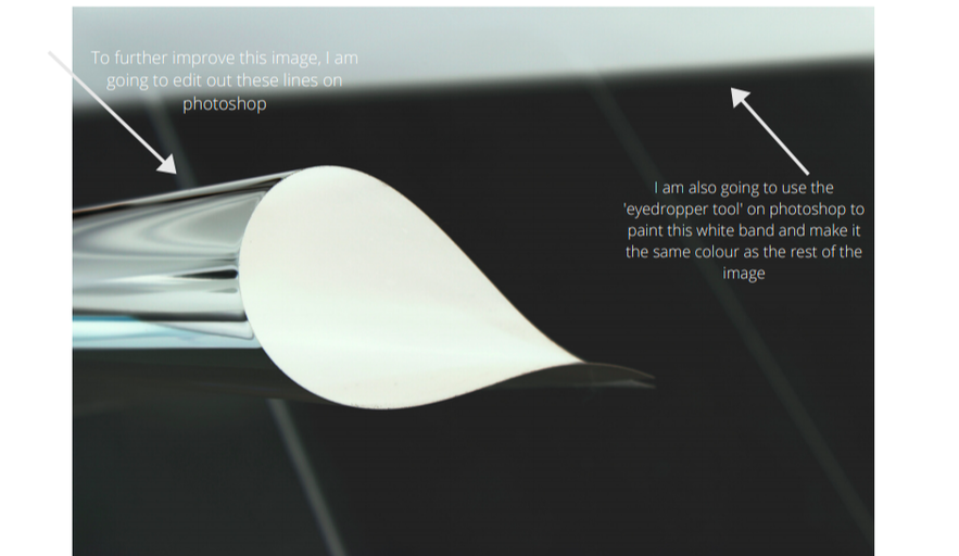
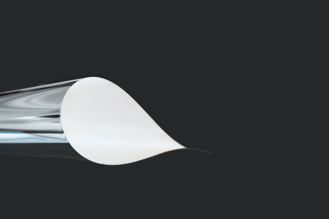
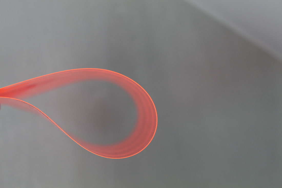
For my response, I chose to use a flexible mirror as I thought that it would create interesting reflections. I rolled up the flexible mirror and tried to create similar shapes to Tillmans' series. I wanted there to be a strong light directed on the 'paper drops', so I held the paper directly onto areas of my house where there was a lot of sunlight. As this was my first attempt, you can see my hands in some of the images trying to hold the paper up, so I am going to try and use photoshop to edit my fingers out. I really like how the interior of the 'paper drops' is softly blurred and the exterior of the paper is in focus. I particularly like the way I used an abstracted, flexible mirror instead of just paper. The light reflecting on this mirror created interesting shapes around the paper, further abstracting the image. Even though I was successfully able to respond to Tillmans work, I definitely think I can experiment with more materials, like coloured acetate. Also, when I develop this further, I will make sure I position the 'paper drops' in a way so that I won't have to hold them up. For now, my next step will be to use photoshop the images where my fingers show. Additionally, I want to experiment with different tools on Photoshop to create different effects. For example, in Tillmans' work, his 'paper drops' have hints of different colours in them, so I aim to use the 'photo filter' on Photoshop to also add some colour to my images.
Using Photoshop to edit my images
|
|
|
|
Further experimentation on Photoshop
Outcome
Improvements
Photoshop steps
|
|

Final edit
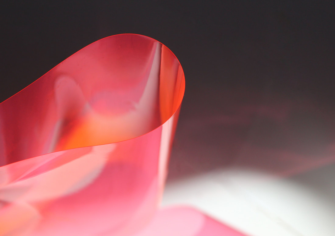
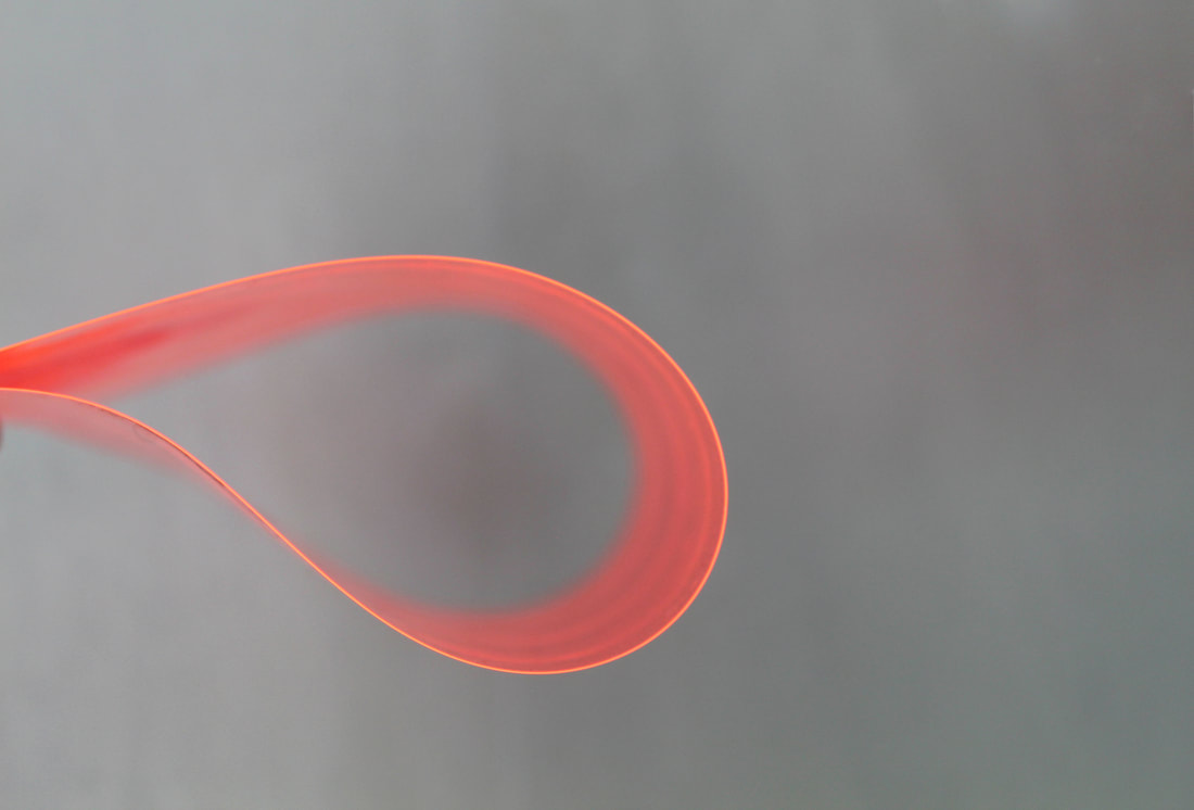
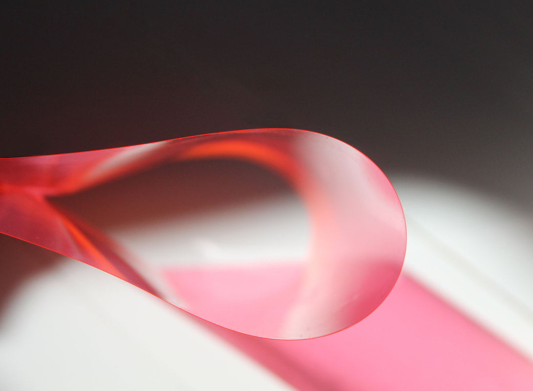
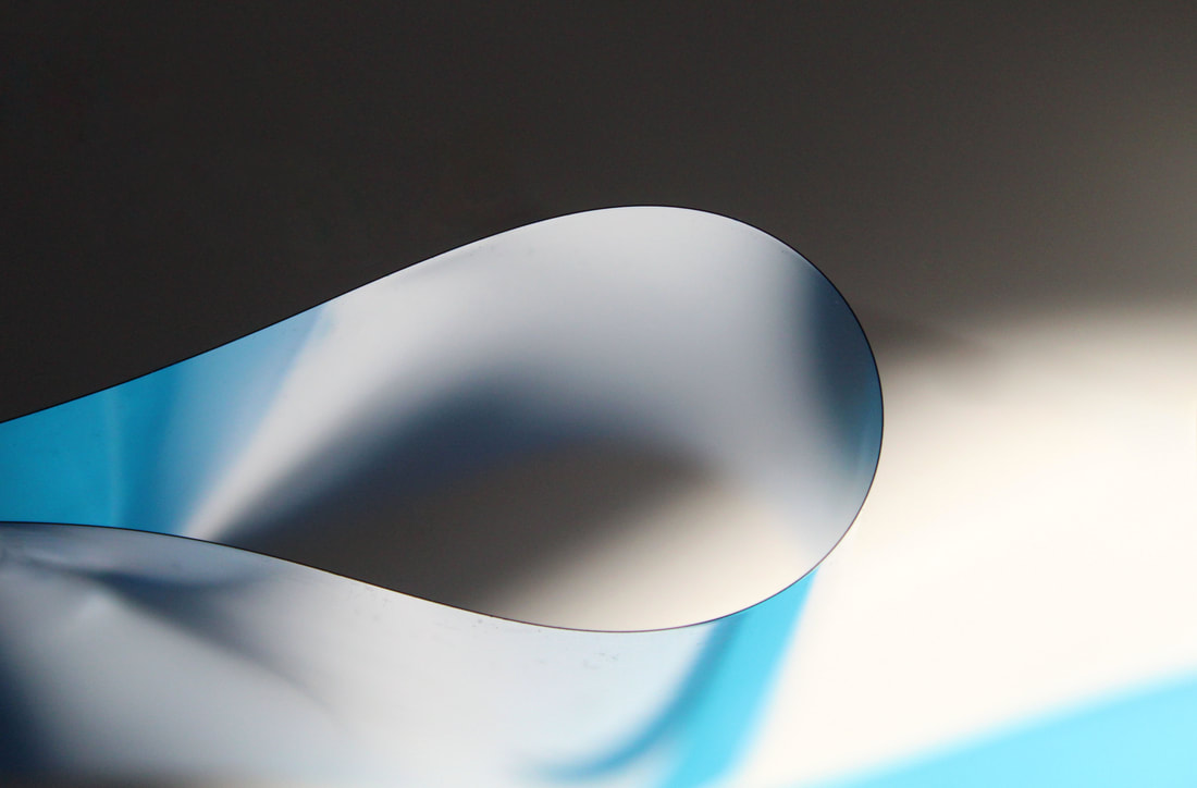
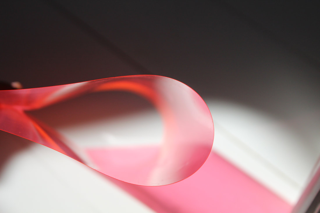
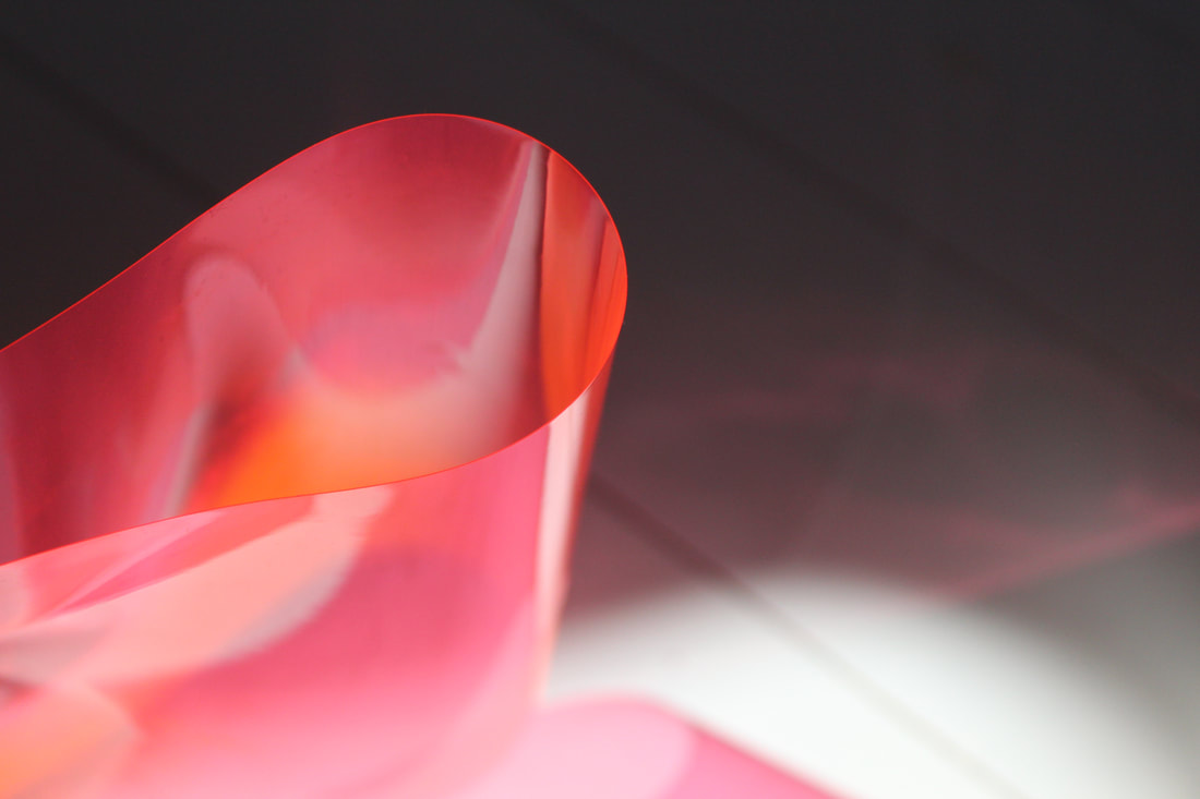
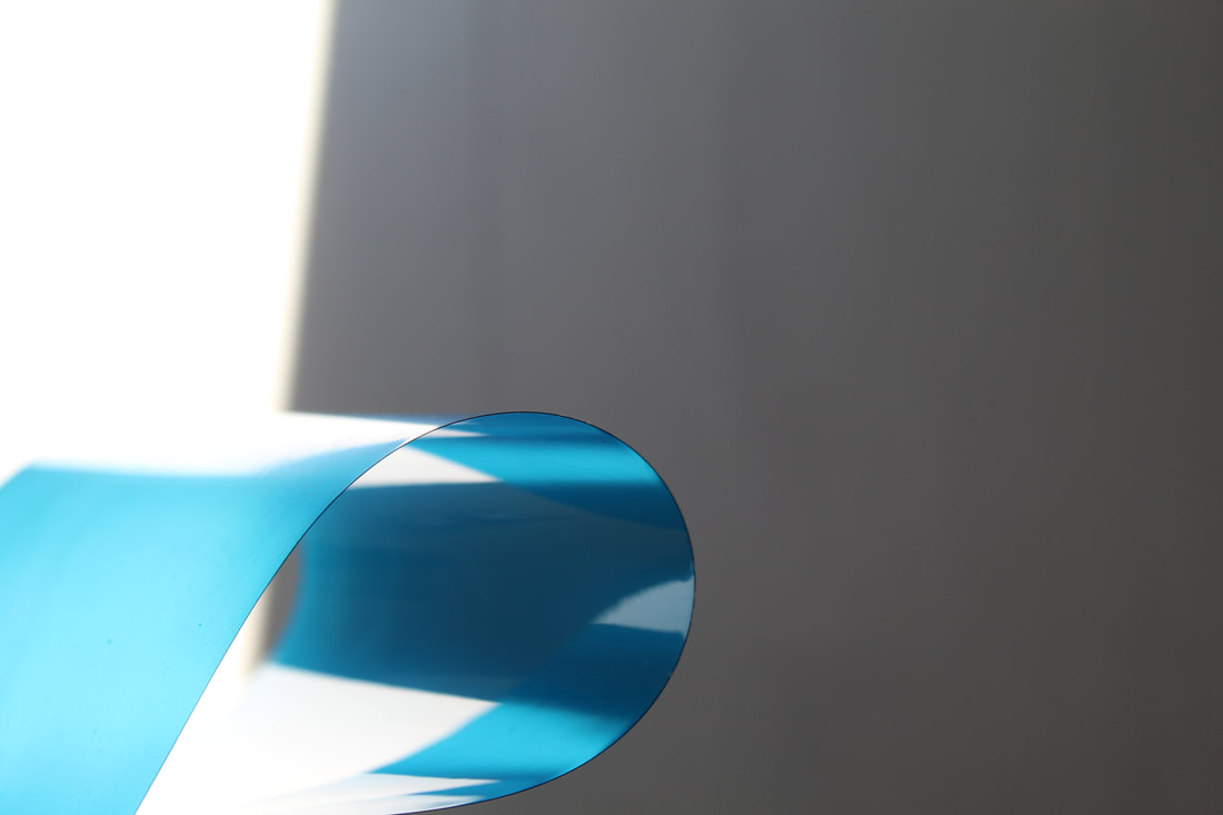
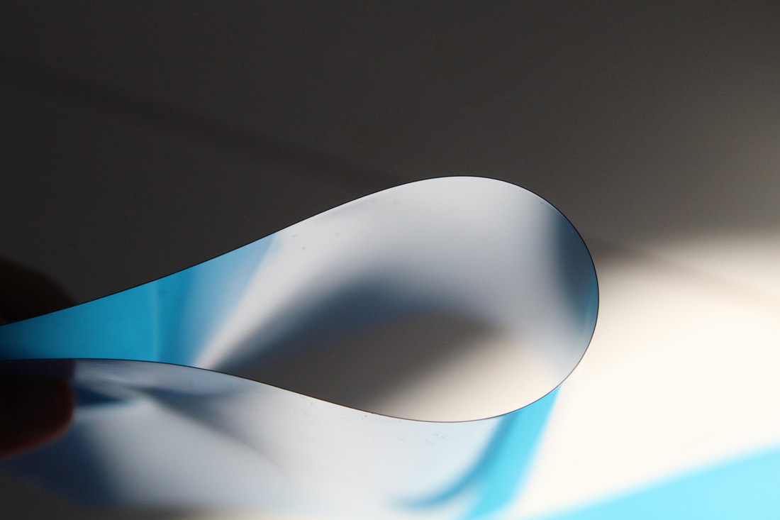
NEXT DEVELOPMENT: Using coloured acetate paper
Best images: Unedited
|
|
|
|
|
|
Editing steps
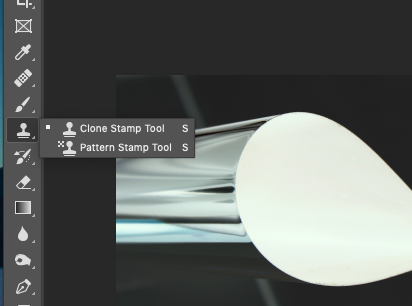
In order to photoshop my images, I opened my images. I used the 'clone stamp tool' in many of my images to remove any unnecessary parts of the image, for example, the image below had lines in the background so I cloned them out. I then used the 'healing brush tool' to fix any more imperfections that were created whilst using the clone stamp tool. I sampled the surrounding area and blended any imperfections into the image. Finally, I went to Image > Crop to crop my image. I repeated these steps with many of my images. If some images needed brightening, I went to Image > Adjustments > Brightness/Contrast and adjusted the brightness.