Saul Leiter
|
|
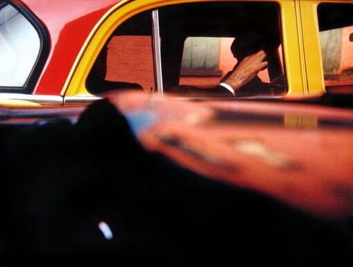
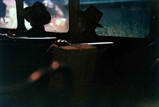
Saul Leiter was a photographer who stood at the crossroads of fashion, street photography, and abstract expressionism. Having started out as a painter, he was influenced by colour, shapes and the camera as a tool for turning reality into his very own vision. While walking the streets of New York, he shot with the kind of freedom that allowed him to experiment with framing, depth of field and colour. It’s this experimentation that defined his style.
Leiter used reflections, mirrors, glass, shadows and silhouettes to photograph through which created mystery and evoked a story. He also gave an effect of blurriness in his photos through wet windows with rain, or condensation from shop windows. He wanted to use every colour that the city offered but he wanted the colours in his images to complement each other. The vibrant colours he captured almost gave his images the effect of strokes of colours. One of Leiter’s techniques was using shallow depth of field to throw different parts of an image in and out of focus. While this sometimes had the effect of bringing attention to a subject in the photo, it was also a way to simply to play with abstracting objects. Although he photographed in the crowded and busy city of New York, he was still able to represent a peaceful humanity which contrasts with the frantic city.
Leiter used reflections, mirrors, glass, shadows and silhouettes to photograph through which created mystery and evoked a story. He also gave an effect of blurriness in his photos through wet windows with rain, or condensation from shop windows. He wanted to use every colour that the city offered but he wanted the colours in his images to complement each other. The vibrant colours he captured almost gave his images the effect of strokes of colours. One of Leiter’s techniques was using shallow depth of field to throw different parts of an image in and out of focus. While this sometimes had the effect of bringing attention to a subject in the photo, it was also a way to simply to play with abstracting objects. Although he photographed in the crowded and busy city of New York, he was still able to represent a peaceful humanity which contrasts with the frantic city.
First Response
|
|
|
Best images
|
|
|
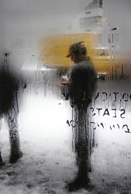
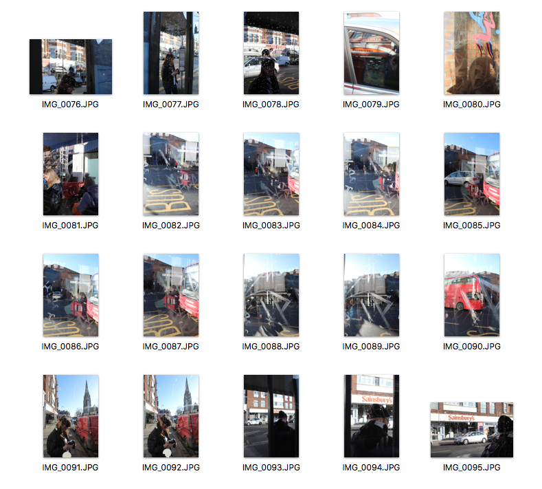
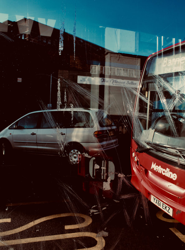
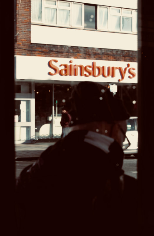
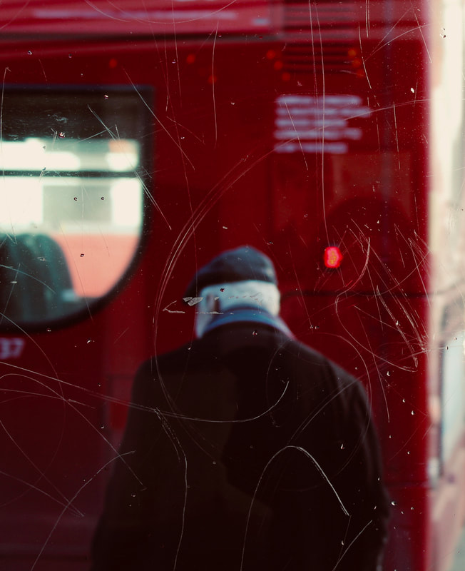
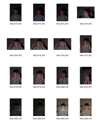
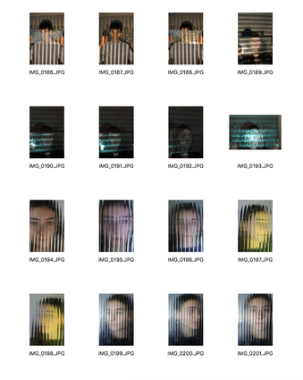
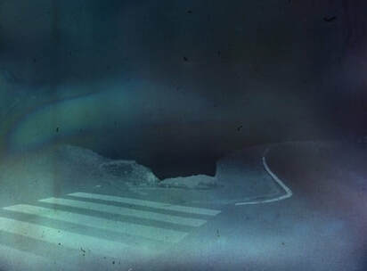
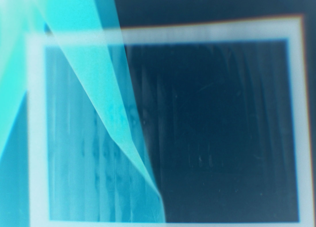
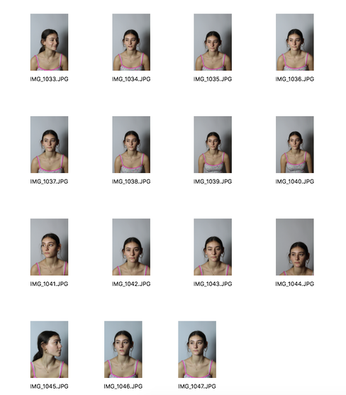
In this task, I had to go around Muswell Hill broadway and try and capture people through different materials. For example, through reflections, through bus stops or through doors. I had to really focus and pay attention to small details which I wanted to photograph through. Saul Leiter's images gave me ideas on what to photograph. This image on the left that I photographed is my favourite. I captured a man waiting at a bus stop through the glass of the bus stop. I purposely did not want to capture the man's face as I wanted to create a sense of concealment and mystery, just like Saul Leiter was aiming to do. To make the image more effective, I increased the contrast to really emphasise the difference between the man's blue scarf and the red bus. I also lowered the brightness to make the deep red colour of the bus contrast with the man's white hair and I also increased the saturation slightly to enhance the vibrant colours. When I was photographing, I used 'manual focus' so that I could adjust how much I wanted my image to be focused. I really like how this turned out because the man and the bus are slightly out of focus whereas the scratches on the glass are more focused which really links to this idea of concealment. However, I would have liked to have captured more images focusing on people as I only got very few images of people. Also, I would have liked to capture people through other mediums like foggy windows or windows that had condensation on them to further emphasis the idea of mystery.
|
Exhibition Visit - Taylor Wessing Photographic Portrait Prize
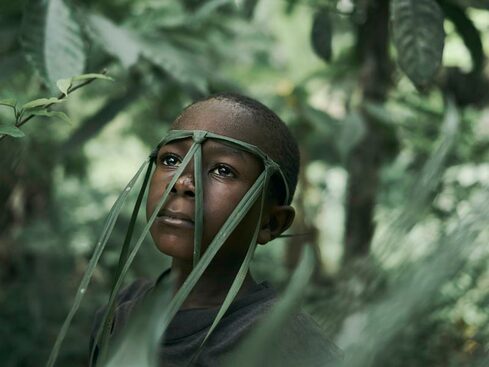
I visited the Taylor Wessing Photographic Portrait prize exhibition which took place in the National Portrait gallery. Thousands of photographers enter each year, and this year 57 works were chosen for the exhibition and each photograph presented a wide range of styles and approaches. Below are 2 images that stood out for me the most and the stories behind them give the images so much more meaning which I think is very important when capturing an photograph.
|
Portrait of 'Strong' Joe Smart by Joey Lawrence
This won the third prize and I especially liked it as the boy's facial expression really evokes a sense of empowerment. His gaze is so captivating which made me want to know more about the story behind this image. I also like how the photographer's use of focus to draw attention to the boy and his headdress, rather than the background. Joey Lawrence captured this image in the remote village of Tombohuaun in Sierra Leone's Eastern Province. He was working with WaterAid to highlight the dangers of dirty water. Lawrence described how the boy made a mask out of grass in the morning and wanted to keep it on during the portrait. He also highlights the fact that the boy always held a very empowered look and I think this is clearly presented in the photograph. |
|
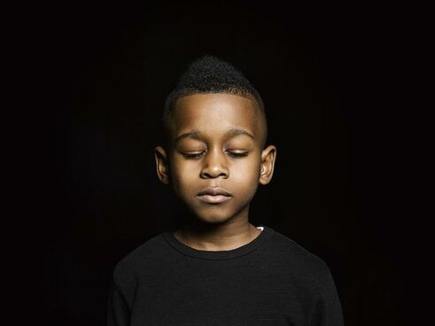
Children of Grenfell by Richard Ansett
This image is of Danel, who is one of five children who survived the Grenfell Tower fire, having escaped with his brother. This photograph caught my attention as I think it looked very powerful and emotional. Danel must have experienced a lot of psychological distress and I like how the photographer captured Danel closing his eyes. This could also suggest that he is trying to remain quiet. I also like how Danel's black top and black background match which could suggest how he has lost all his belongings due to the fire and he might feel empty and lonely. |
Studio Abstract Portrait
Erwin Blumenfeld
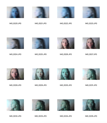
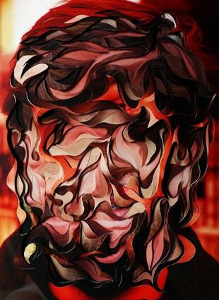
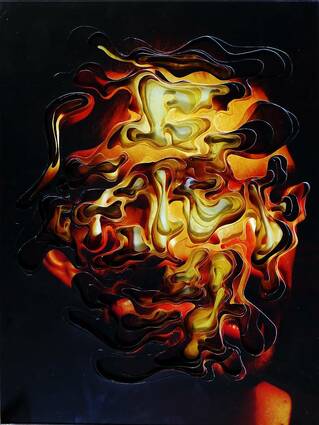
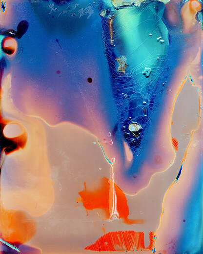
Erwin Blumenfeld was a German artist and photographer, he was regarded as one of the most influential photographers of the twentieth century. An experimenter and innovator, he produced an extensive body of work throughout his thirty-five year career including black and white portraits and nudes, celebrity portraiture, advertising campaigns and his renowned fashion photography. In these images above, he uses colour and glass to distort his images. He also used many different photography techniques in his work, such as double exposure, sandwich printing, solarisation, veils and mirrors. I am going to do a similar technique to Blumenfeld and use distorted glass with different coloured filters to create abstract portraits.
|
|
|
First Response
Contact Sheet
|
|
|
Best Images
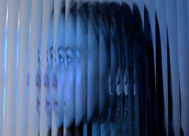
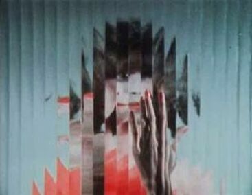
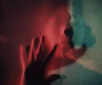
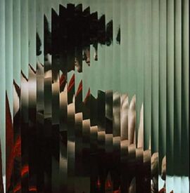
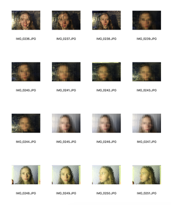
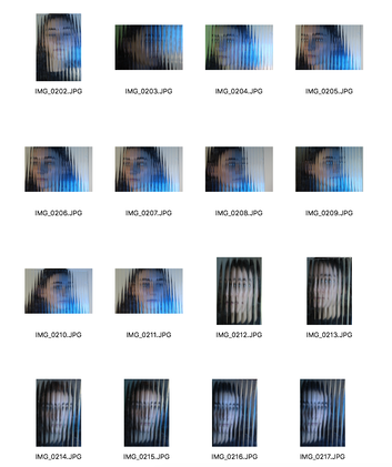
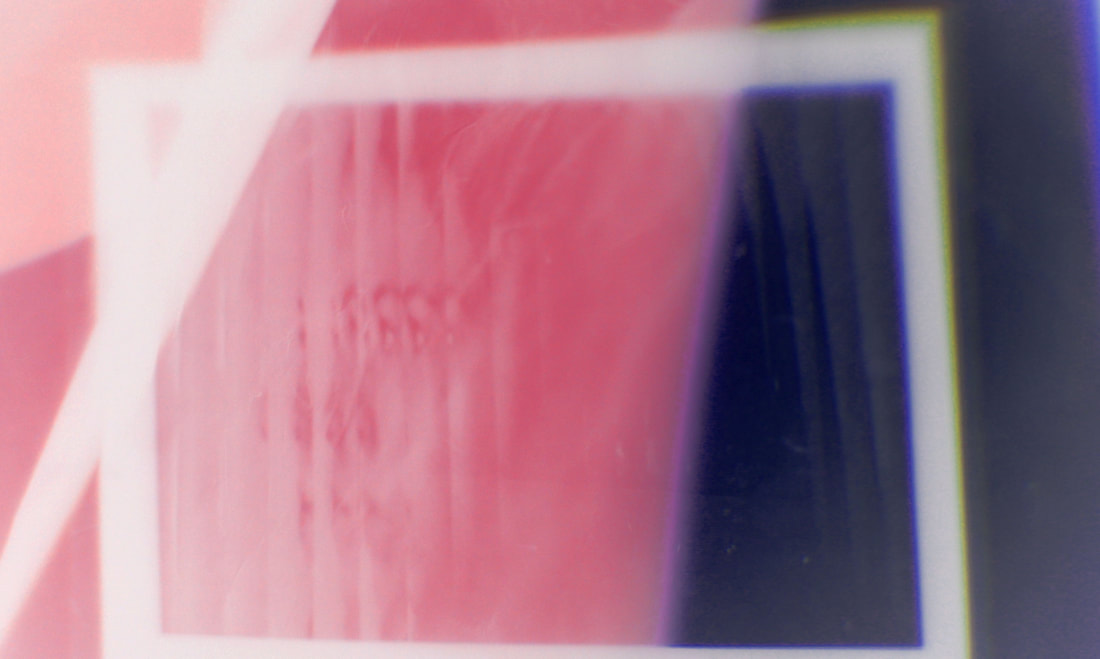
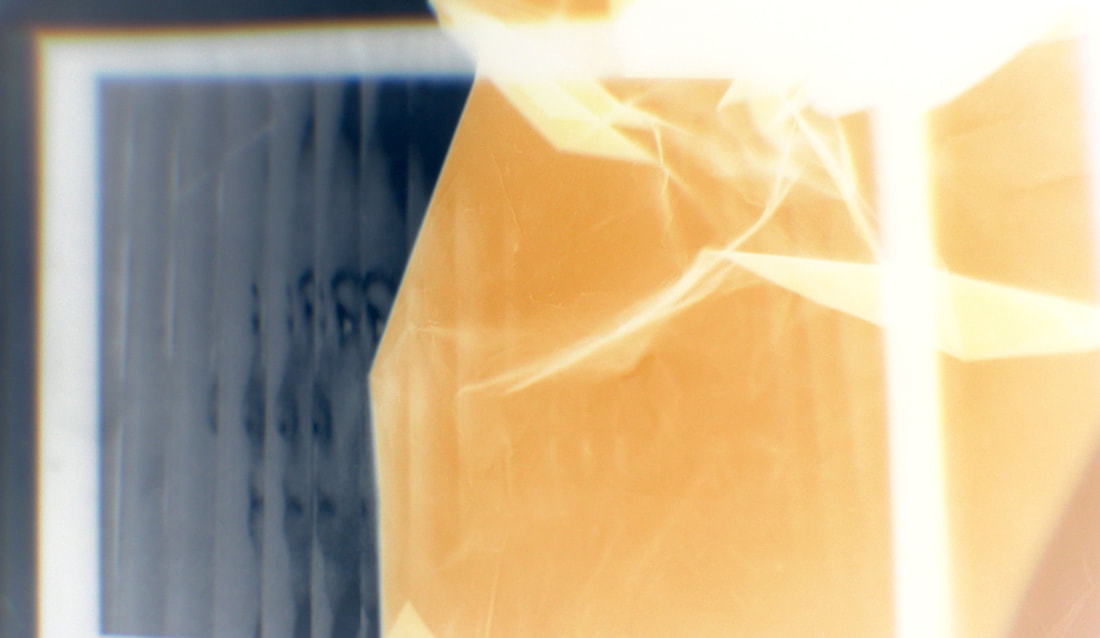
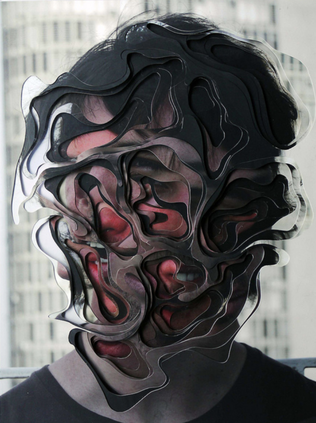
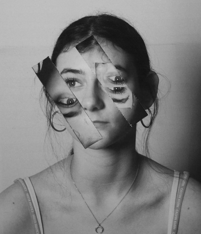
In this task, I had to photograph people through different materials, for example, distorted glass. As I was responding to Blumenfeld's work, I made sure that I used similar techniques to him. Using vibrant colours was one of the main focuses in his work and it really added to the idea of abstraction. In my images, I used a projector and placed different coloured papers onto the projector to give the backgrounds of my photos more colour to it. Additionally, I made the model hold a piece of distorted glass up against their face. However, I did not like the images that I took using the projector as they were not close enough and I hadn't composed them well enough. I also used the studio lights and a white backdrop, which I preferred. I first used a piece of glass which almost looked as if it was splitting up the model's face. I also wanted to use coloured filters in front of the lights so I put a blue filter in my first image which I really liked. If I was going to develop this, I would have made the model wear red lipstick or a bright coloured top so that there could be one repeated colour throughout the image. This is similar to what Blumenfeld did where in one of his images, the model is wearing red lipstick and a red top.
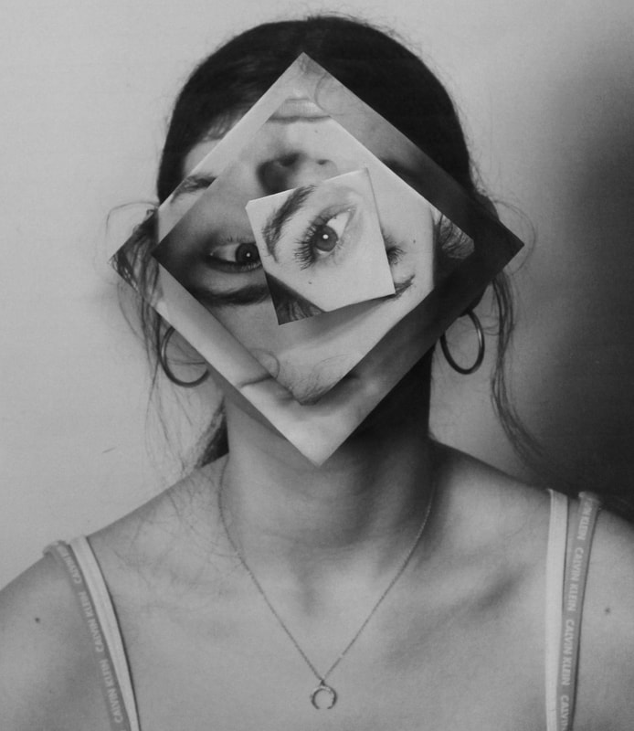
In my second best image, I also used a piece of glass but it was much more distorted which I thought was really effective as it looked as if the image had been made from brush strokes. I also like how I added a yellow filter because the glass actually also distorts this yellow colour and places it in different places.
In my second best image, I also used a piece of glass but it was much more distorted which I thought was really effective as it looked as if the image had been made from brush strokes. I also like how I added a yellow filter because the glass actually also distorts this yellow colour and places it in different places.
Daisuke Yokoto
Daisuke Yakoto went to a photography institute in Tokyo where he specialised in photography. Yakoto rephotographs and prints his images multiple times which creates a very unique end product that is very difficult to remake so every single one of his images are different. Toransupearento (transparent), was one of his series where he used different techniques and processes, like sandwich printing and solarization, to completely transform his images. He also applies acids and flames to his images to really distort them which reinforce the idea of abstraction.
Toransupearento
|
|
Abstract Experiment
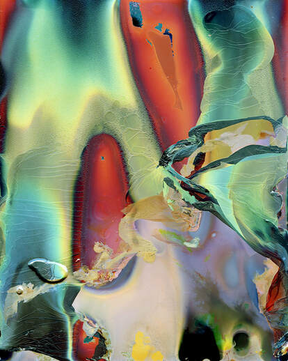
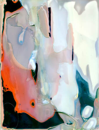
Using the images that I took in the studio, I had to experiment with them in the darkroom and use different developing techniques like splashing or painting the photographic paper with developer. My two images that I chose to develop further were printed out onto acetate and then I took them into the darkroom and used them as my negative. I set the aperture on my enlarger to 11 and I then had to use a test strip to find the right amount of time I wanted the photographic paper to be exposed for. For my first image with the blue filter, I tried 2, 4, 6, and 8 seconds and found that it was about right in between 2 and 4 seconds. For my second image (with the yellow filter) I also tried 2, 4, 6 and 8 seconds and 4 seconds was the right amount of time. After I exposed them for the amount of time needed, I placed them in the developer for 2 minutes, the stop for 30 seconds and the fix for 4 minutes and lastly put them in running water for 5 minutes to remove any chemicals. However, I wanted to use different techniques to experiment with my images and make them more abstract. Instead of placing them into the developer, I used a paint brush and splashed the photographic paper with some developer so that the image wouldn't fully develop but have interesting brush strokes or splodges. I also put pieces of masking tape on the acetate which made the photographic paper have quite interesting marks on it.
Using Photoshop
After developing my images in the darkroom, I photographed my favourite ones and uploaded them onto photoshop and added filters to them to make them look even more abstract. However, I did not really like how they looked so I decided to use the acetate paper that I originally used and placed them on a projector with different coloured paper on top of them. I scrunched the coloured paper a bit to give a more abstract look. After photographing this, I uploaded them onto photoshop and actually inverted my images which made the colours much more vibrant and the acetate paper showed much more. After inverting them, I went to Image > Adjustments > Levels and adjusted the levels of the image. I also went on 'Hue and Saturation' and adjusted the saturation a bit. I repeated this process for my favourite images. I decided not to fully crop the whole image for some of the photos as I quite liked the different colours that were around the frame.
Edits
3D Abstract Portraiture
Lucas Simoes
Lucas Simoes is a Brazilian artist based in Sao Paulo. He was born is 1980 in Cantaduva and moved to Sao Paulo in 2002. He went to an Architecture school. His portraits are not ordinary portraits, they are transformed by cutting different sections of the photograph and layering them. While photographing these portraits, he asked his friends to talk about one of their secrets. He wanted to capture the expressions of each moment rather than actually listening to their secret. In addition, he asked them to choose a song for him to listen to while photographing them. I particularly like how at the end of shooting them, he asked them what colour they associate their secrets with, and this decided what colour the portraits carried. I think this gave each image a very unique story behind it. I particularly like the second image below as I think the bright, vibrant colours in the centre of the image really brings the viewer's attention to the centre. I also like how it also gets darker around the image. I will use Simoes ideas in my work, for example, using bright colours which really catch the viewer's attention.
|
|
|
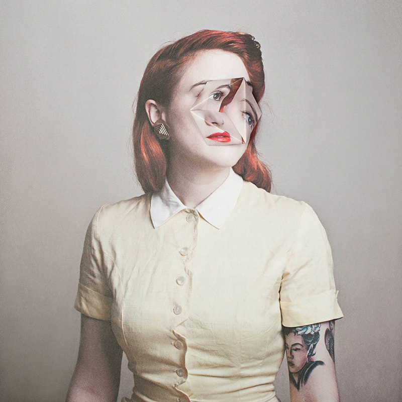
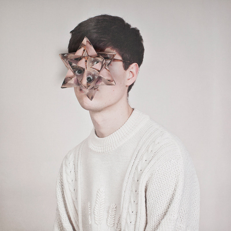
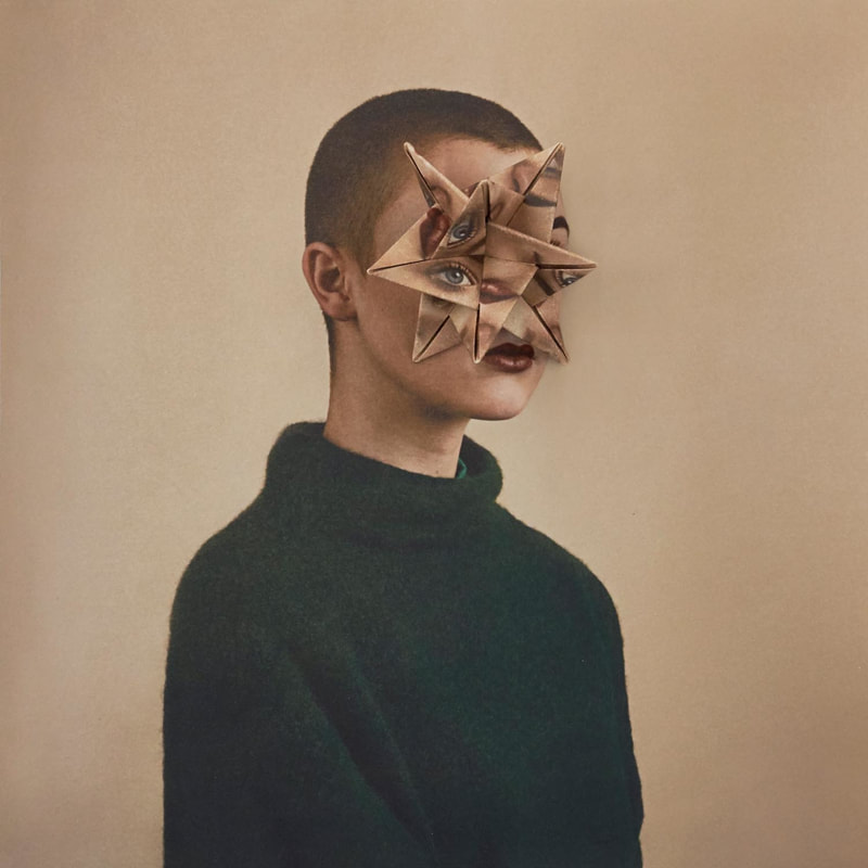
Alma Haser
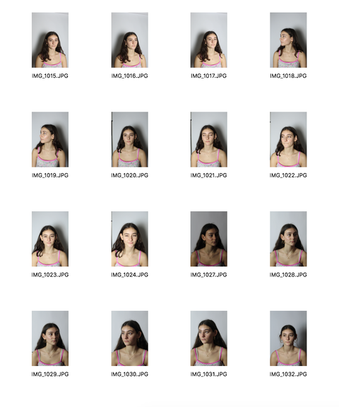
German artist Alma Haser, lives in London and was born in 1989 into an artistic family. Her portraits combine her photography skills with collage and origami. She creates these complex portraits by positioning her models on a chair and photographs them and then printing out multiple copies of the same image. She uses her origami techniques to fold her printed images and then placing this origami structure on top of the model's face and then rephotographing the final piece. I really like how her final pieces look and how it is just focused on the centre. I especially like the third image below as I think there is something about the model's posture that makes the image look powerful. I also like how the model isn't looking directly at the camera. Using Haser as my inspiration for my own response, I will think about having my model sat in a very upright position as I think this makes the whole image more strong and effective.
|
|
|
Overall, I think both photographer's work is very powerful in their own unique way. Simoes uses many layers which gives the images a lot more intricate details and uses very vibrant colours, whereas Haser's images look quite minimalist as the colours are quite dull and there isn't much going on. For my response, I will consider using both photographer's techniques. I really want to have bright colours in my response however, I want to have more of the model's posture in the photograph, instead of just having their face.
Contact Sheet
|
|
In this task, I used Alma Haser's and Lucas Simoes' technique to try and make similar 3D portraits. I printed out 10 of the same images so that I could cut up different sections of the photos and layer them on each other. For the image on the left, I cut out two long rectangles and underneath I used another print and flipped it upside down. I also cut out her eye and stuck it on upside down. I really like how this turned out as I have really distorted the face and made it abstract. However, I wanted it to look more 3D so I decided to do a second one which is the one on the right. I particularly like the one on the right because I layered 3 diamond-shaped cut outs on top of each other which really emphasised the idea of 3D abstraction. I also like how I placed the diamonds on top of each other as the second layer is upside down.
|
|
My own development of Abstraction
Barbara Vaughn
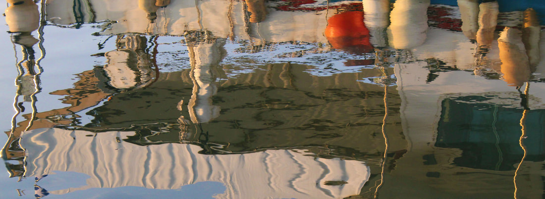
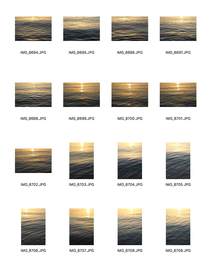
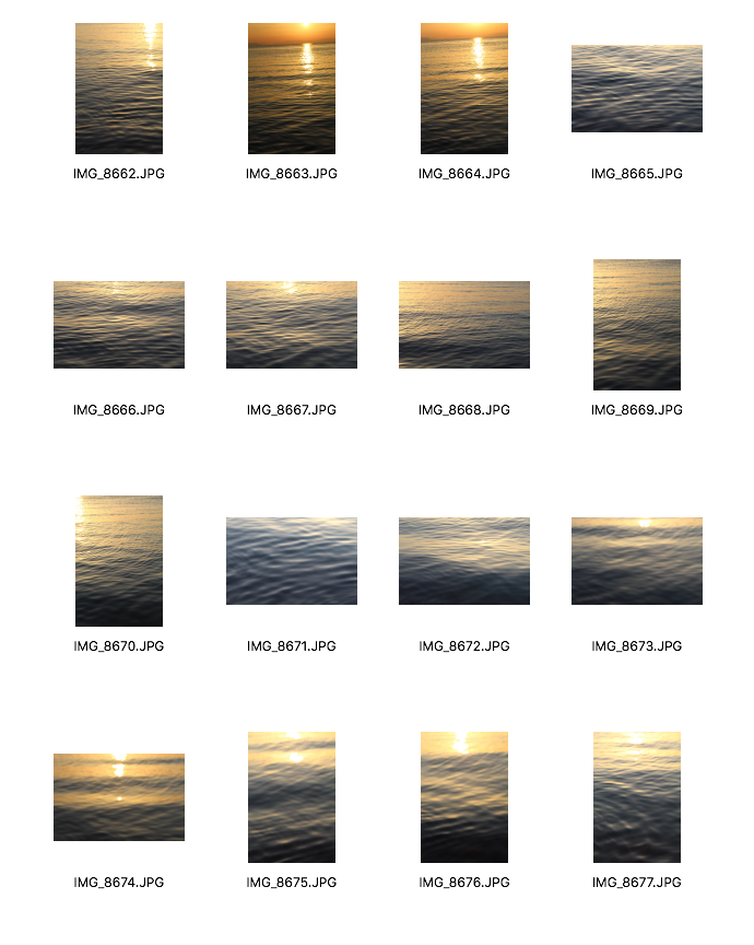
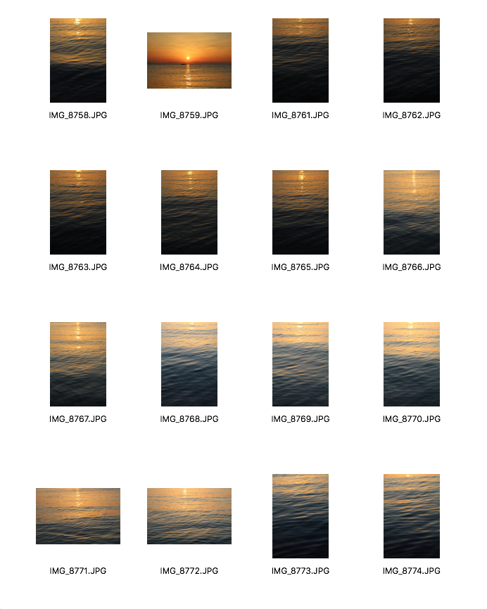
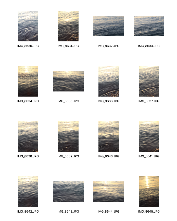
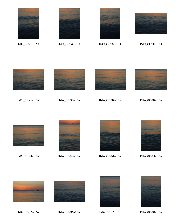
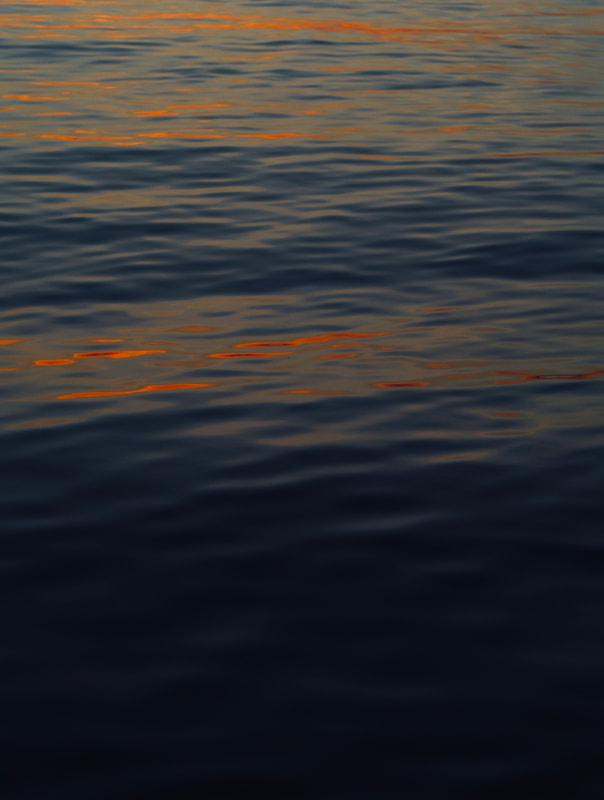
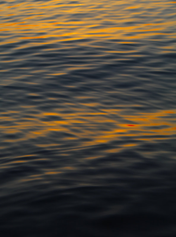
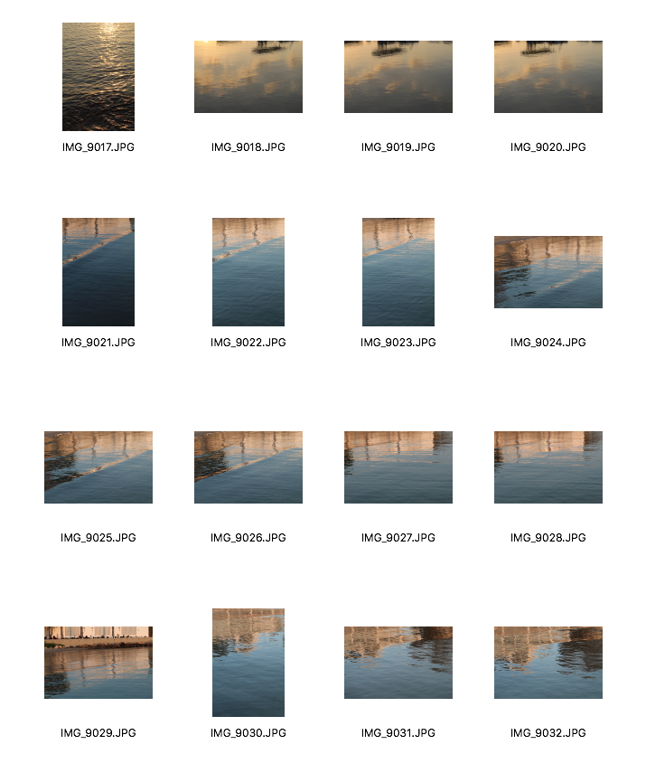
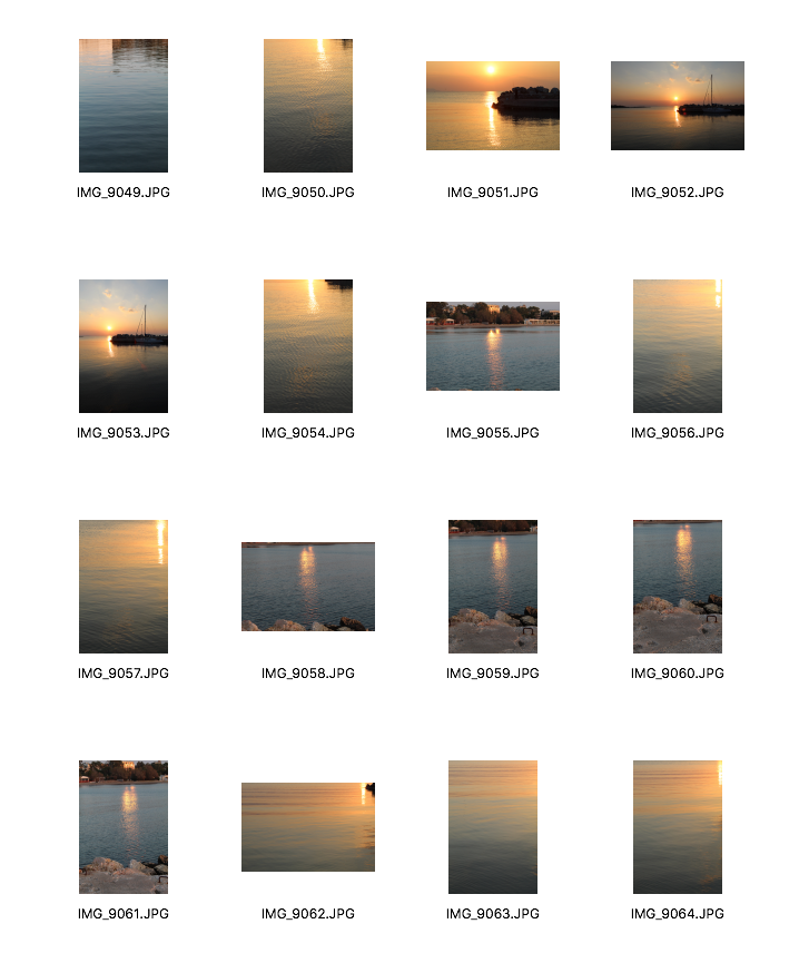
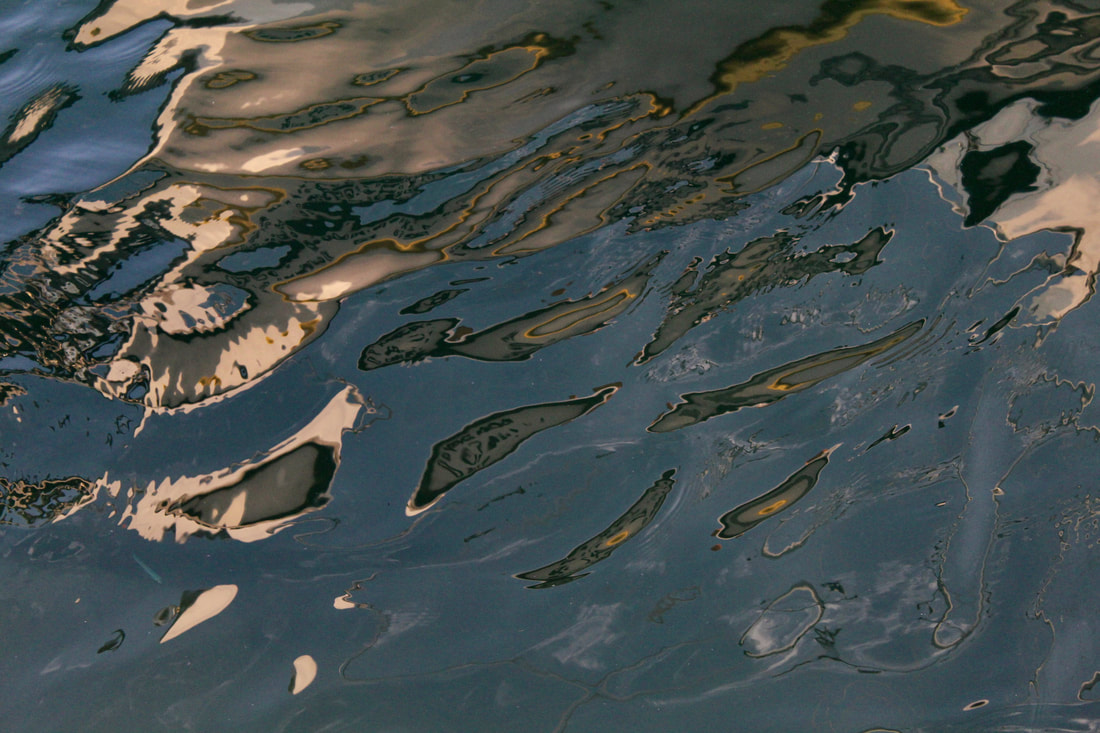
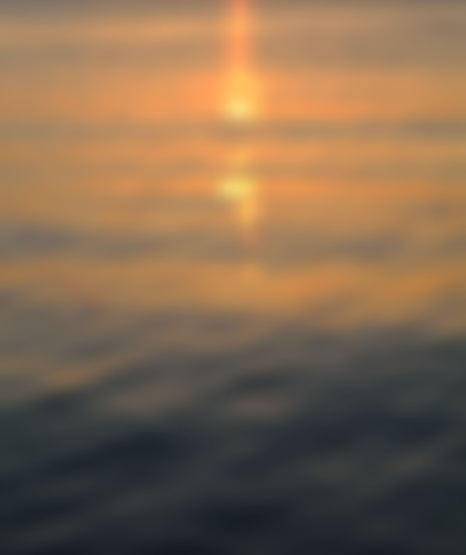
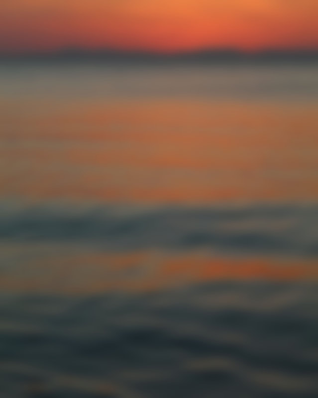
Barbara Vaughn is a fine-art photographer based in San Francisco and New York City. Vaughn's aim in these image was to document abstraction in the real world. These mesmerising reflections on the water engage the viewer and challenges their imagination. In 2007, Vaughn was in Greece and got inspiration from reflections that she observed that were made across the port waters. I was really inspired by her work as I find reflections on water very interesting as each reflection creates a distinct, unique image and every person feels has a different perspective on them. As I am in Greece, I am going to go to the sea and look for reflections similar to Vaughn's and try to capture them. I want go around sunset so that I could get those orangey colours that the sunset creates.
|
|
First Development
|
|
|
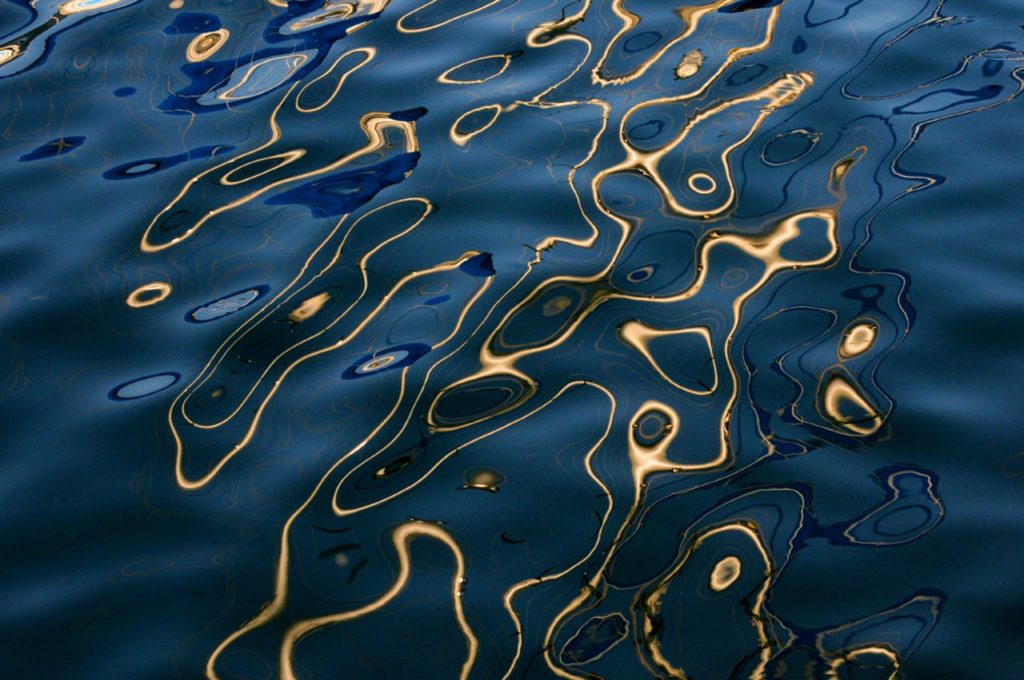
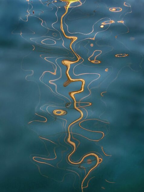
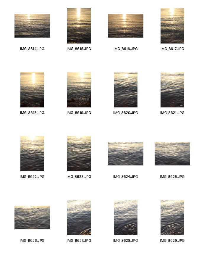
I decided to capture images of the sea and the way that the sun hits the sea to create abstract reflections. I wanted to do this during sunset because I thought the orangey coloured tones created by the sunset would look really effective against the sea. I went at around 5pm and stayed until 6pm to make sure I was capturing all the different colours. As I wanted my images to be quite close up, I had my camera lens on the highest zoom and my ISO was set on 400. I think my images give a sense of calmness as the subtle waves makes the viewer almost imagine the waves moving. I particularly like how in both of my images, the orange and yellow tones are almost arranged in bands which evoke this sense of endlessness. However, my images are quite different to Vaughn's as she photographed reflections made on port waters, so for my next development, I will go to a harbour and focus on the reflections of boats rather than just the colours from the sunset.
|
|
Second Development
|
|
|
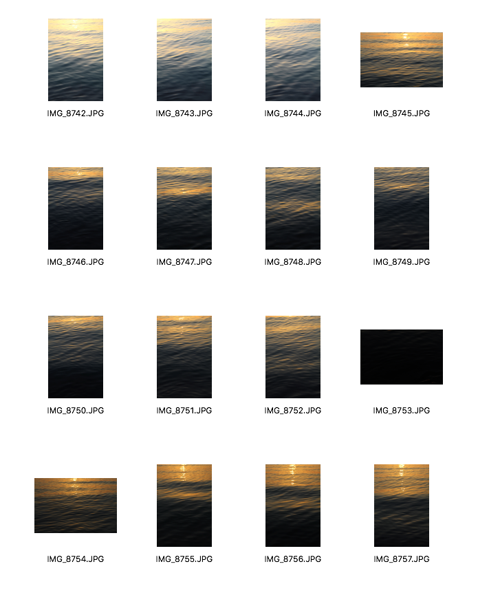
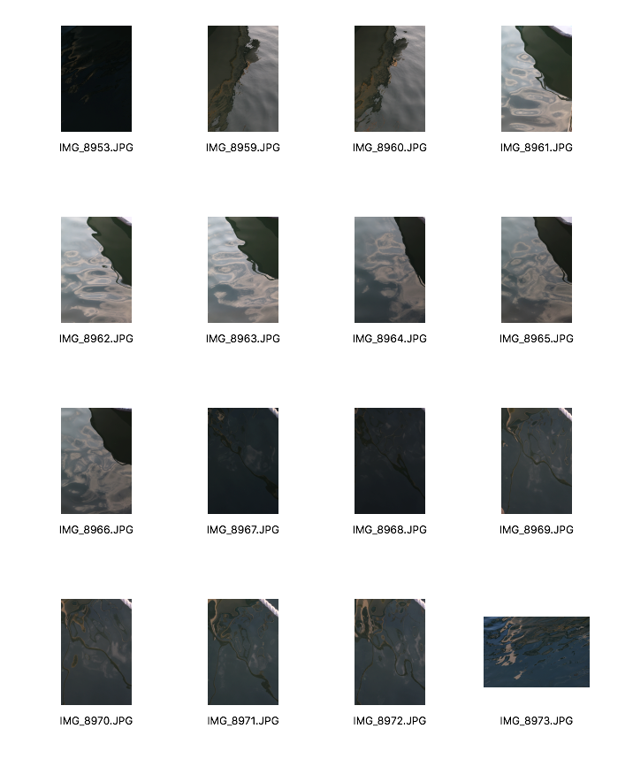
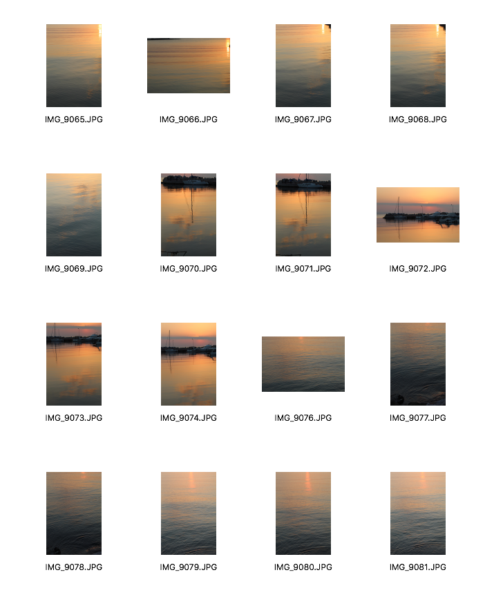
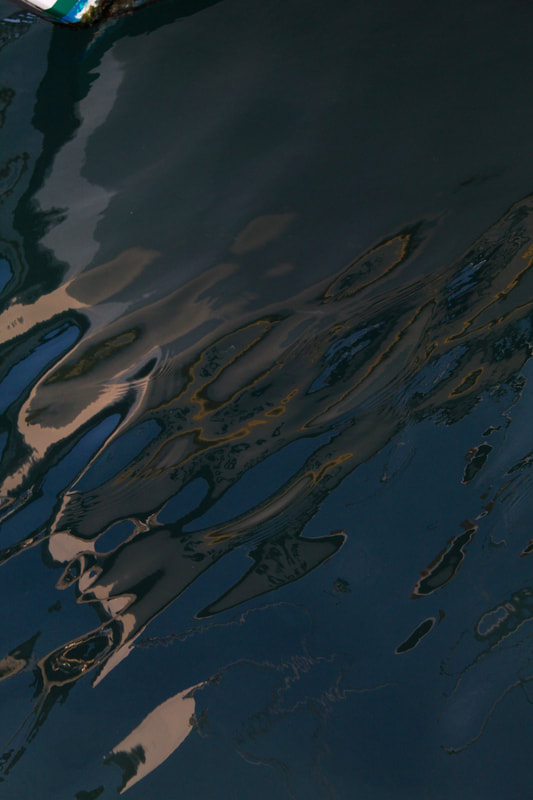
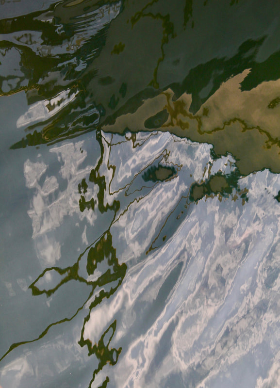
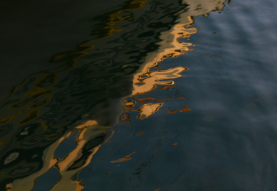
For this development, instead of just photographing the sea and the light, I wanted to capture the reflections of boats in a harbour. I was focused on looking just for reflections and the interesting shapes which were created. These images were successful as I captured exactly what I was aiming to capture. I also noticed that they almost looked like oil paintings which I thought was really interesting. I really like how the light reflected on the sea looks distorted which gives the images an abstract feeling.
|
|
|
|
Third Development
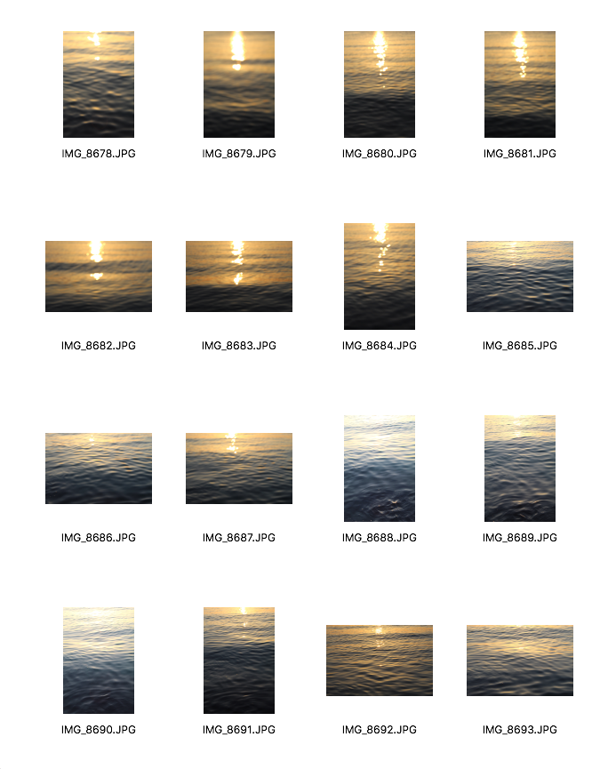
Daisuke Yokoto
Colour Photographs
|
|
|
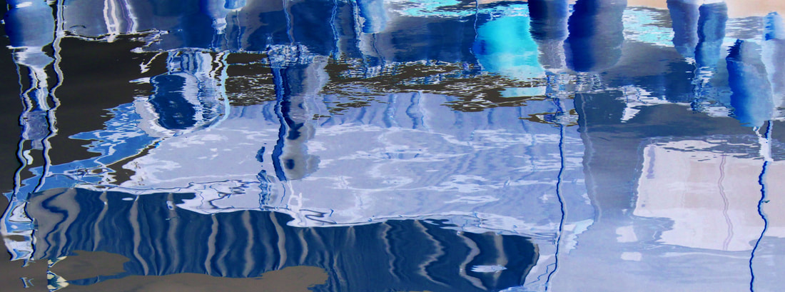
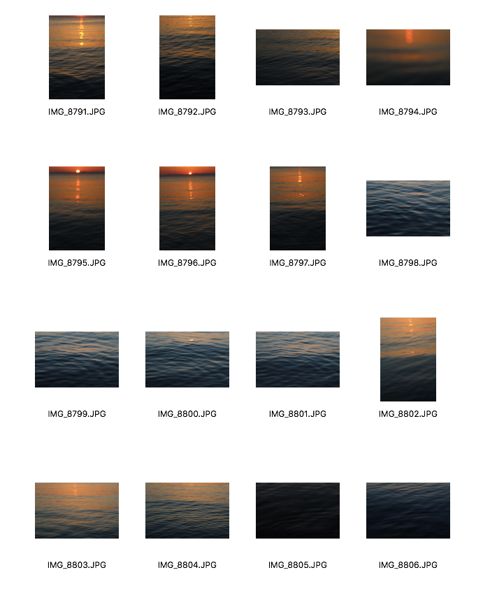
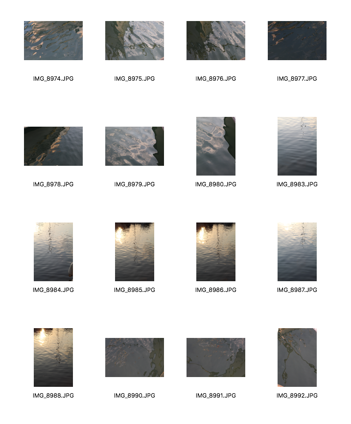
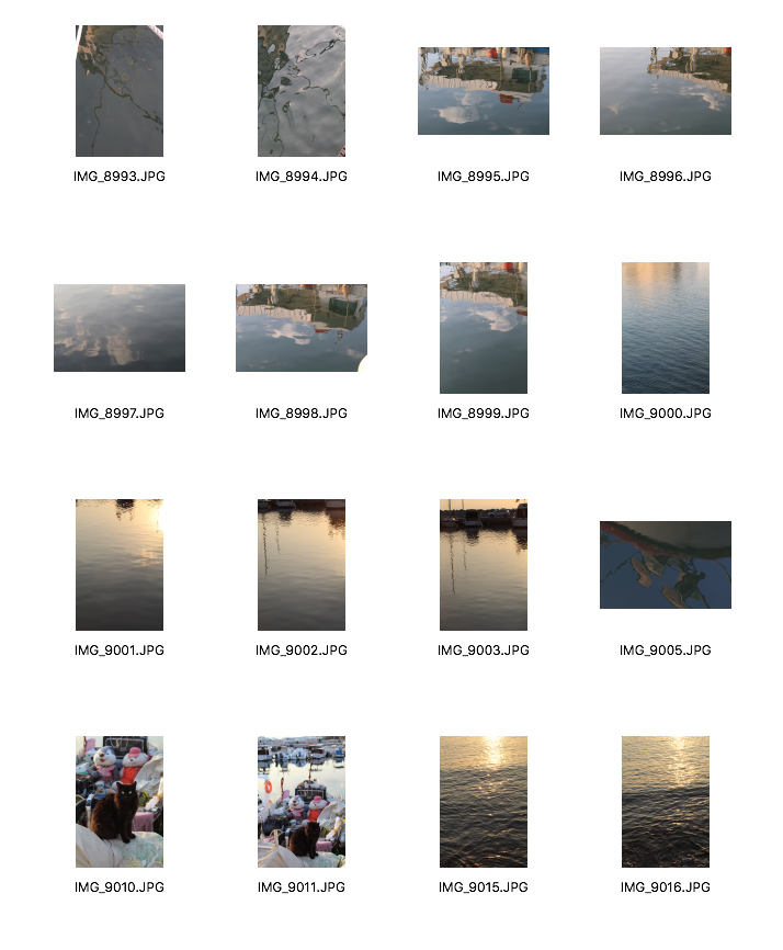
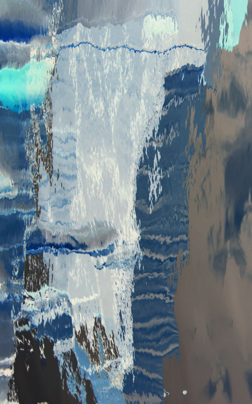
The images I captured of the reflections which almost looked like paintings , reminded me of Daisuke Yokota's work where he physically ruined photographs to create these abstract pieces which have very vibrant colours and interesting shapes. He also used darkroom experimentation which really makes his images unique and intriguing. Instead of physically doing this, I want to use the shapes and reflections made in the sea and go back to the idea of using photoshop for abstract images and inverting the colours.
My edits
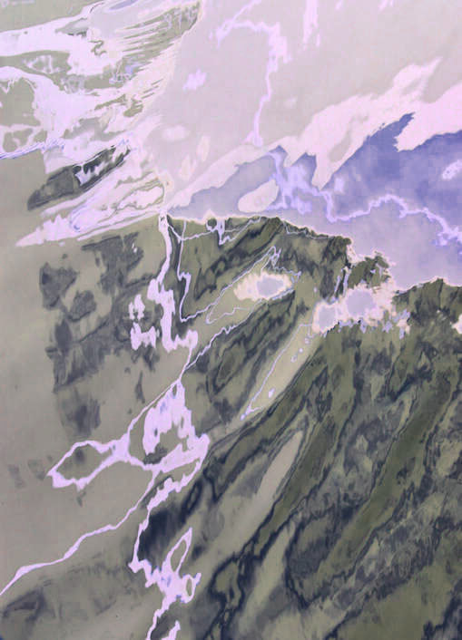
I quite like how these 2 images turned out as when I inverted them, new colours were created which weren't originally in the images. I especially like the one on the right. The abstract reflection and the different blue tones make it look like a painting. I think the image above is also very interesting as the water ripples create even more shapes and shades of colours. However, I would have liked them to have more varying colours like Yokota's 'Coloured photographs' series. For example, there are more bright orange, red and green colours whereas my images just have one colour repeated throughout the whole image.
|
|
Fourth Development
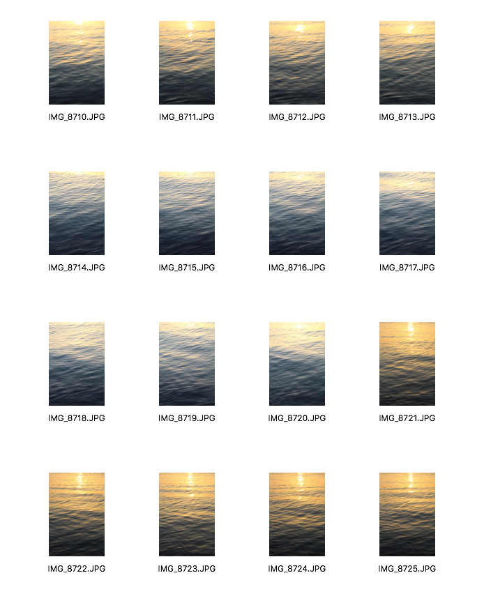
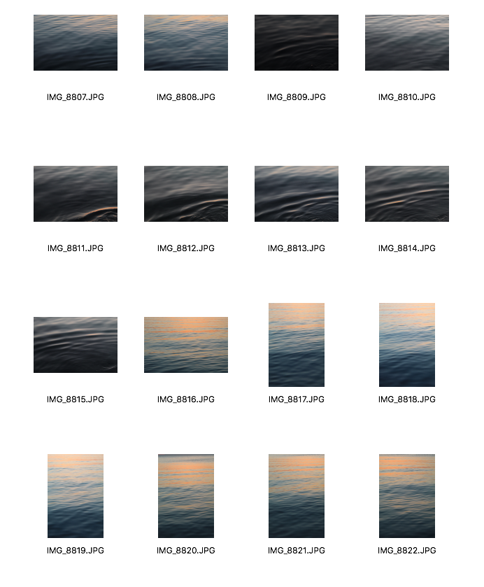
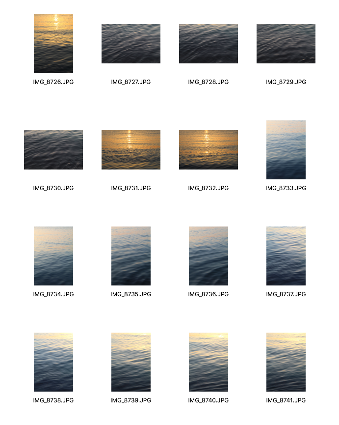
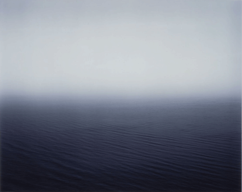
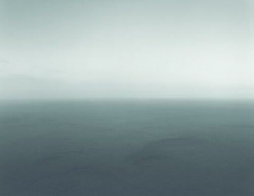
Hiroshi Sugimoto
Sugimoto is a Japanese photographer who in 1980, started a series called 'Seascapes', which consisted of photographs of the sea and its horizon. He has travelled around the world to capture and create these abstract pieces. His images really evoke a strong feeling of endlessness but the same time create this sense of calmness and tranquility. I particularly like how the sky and the horizon almost connect together and create this fade that emphasises his repeated ideas of timelessness and serenity. Even though I quite liked the outcome when I inverted the colours on photoshop, I wanted to develop my interpretation of abstraction further and consider other photographers. I want to use a similar technique to Sugimoto. I will use the images I took of the sea and create this blurred effect on photoshop. He doesn't use much colour in his image of the sea whereas my images are of the sunset which I think could look really effective as the orange and red light created by the sunset will give the image more vibrancy.
|
|
Even though I tried to respond to Sugimoto's 'Seascapes', I did not really like the outcome and I don't think I am going to carry on looking at Sugimoto for my development. Also, I was aware that his images of the sea are very sublime whereas my images are very vibrant. To create my images, I added a layer and then added a mask. I selected Filter > Blur > Gaussian blur and selected the brush tool to blur the image. I had the opacity on 100% but I lowered it towards the bottom of the image to make it look seamless and blended in.
|
|
Fifth Development
|
|
1. I opened my images that I wanted to edit. 2. I pressed 'Cmd' then 'I' which inverted the colours 3. Then I selected Image > Adjustments > Colour balance 4. Then I cropped my image 5. I then selected Adjustments again but pressed Levels 6. I also adjusted the vibrancy under Adjustments 7. I then rotated it to make it landscape 8. Lastly, I took the brightness down which was also under Adjustments. |
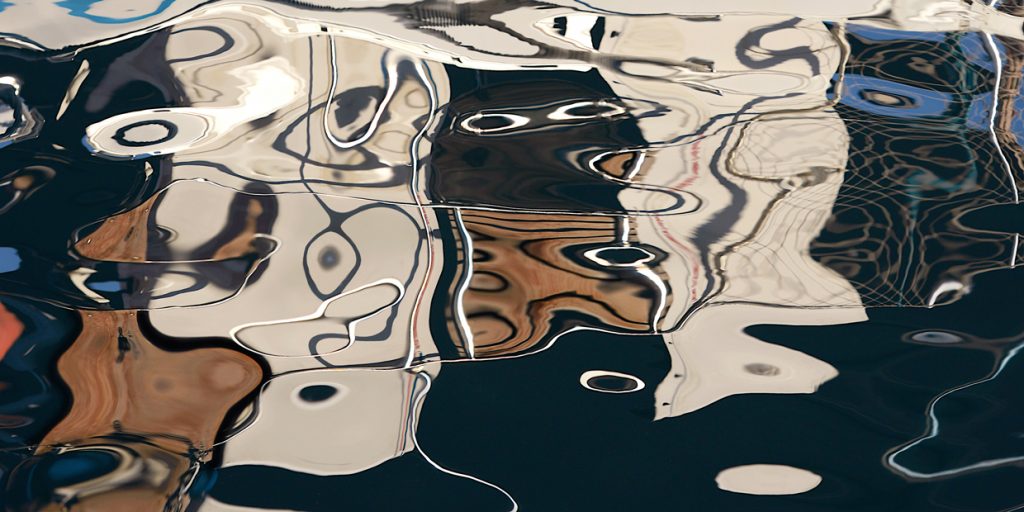
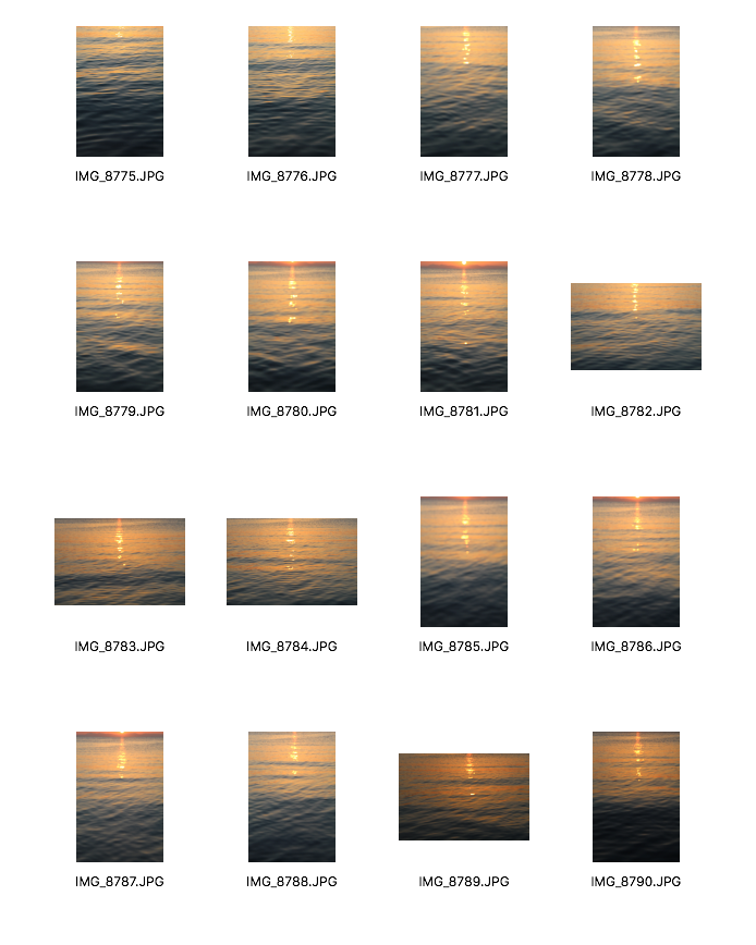
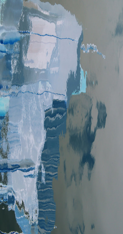
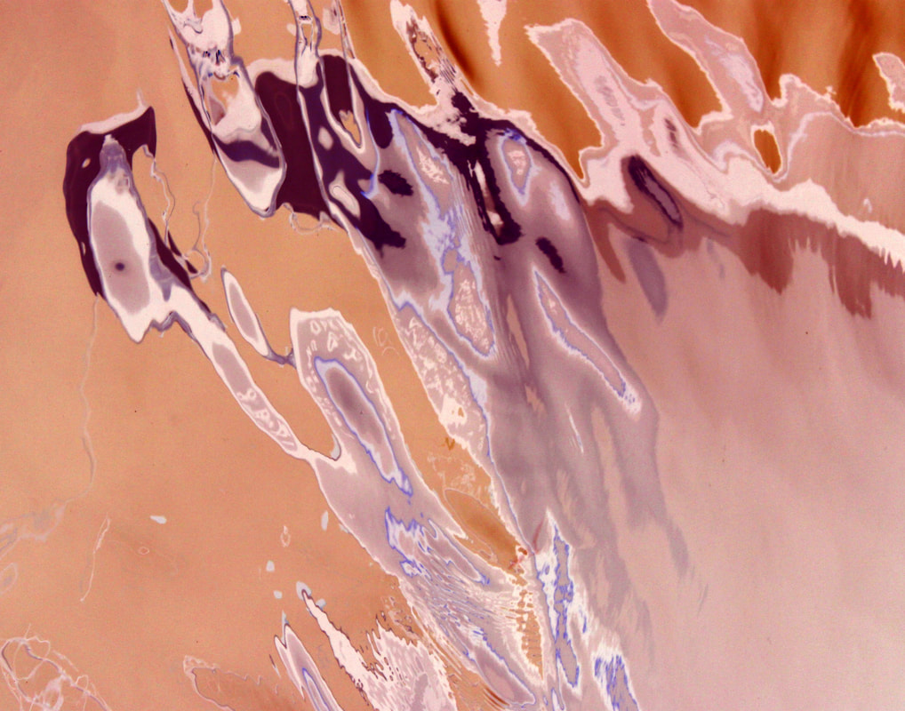
I decided to go back to my third development because I like how I interpreted Daisuke Yokota's coloured photographs in a different way. I have decided to edit more of the images that I took of the reflections in the harbour using the invert tool to create colourful abstract images similar to Yokota's. I will also use photoshop to adjust the colours and brightness. For the image below with the purple tones, I was on photoshop and selected Filter > Liquify which created an interesting shape which almost looks like it was made by the movement of the water. However, I prefer having the reflections in their original shape and not 'liquified' as it could look too edited and almost take away the idea of reflections as it looks like something different.
My edits
|
|
Sixth Development
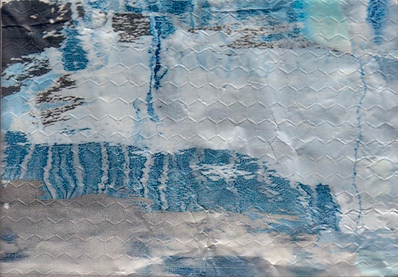
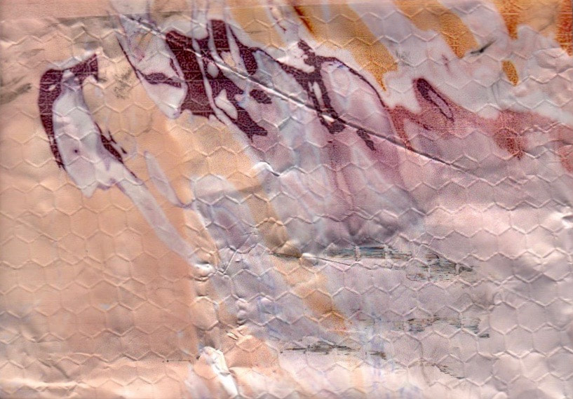
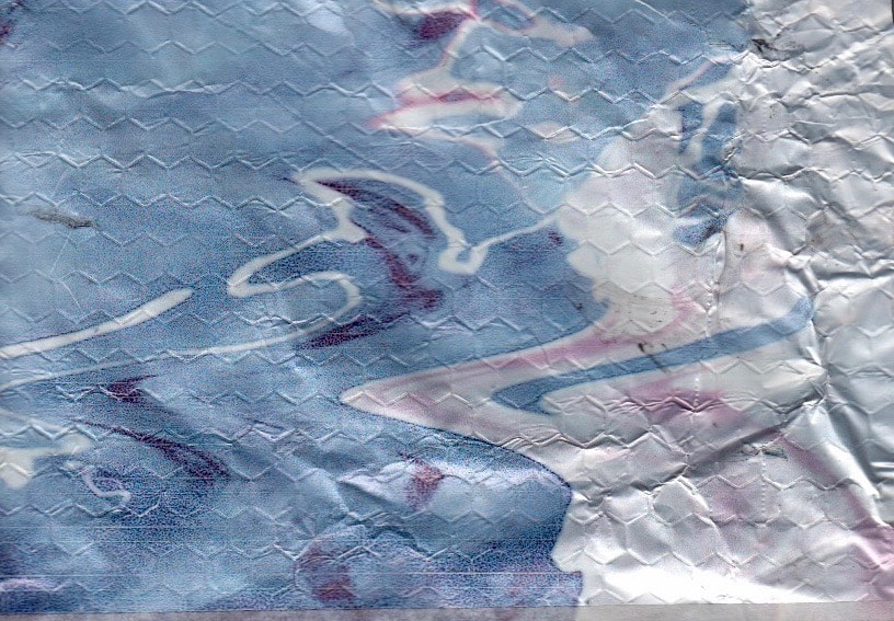
I wanted to experiment more with the images above which I edited on photoshop. I decided to try and print my 3 images on thick aluminium foil. Firstly, I cut up 3 of the same size pieces of foil and stuck them onto an A4 sheet with sellotape. I then scanned in the A4 sheet with the foil onto my computer and opened it up on photoshop. I opened my 3 images onto photoshop too and made them the right size to fit onto the foil. I put the paper with the foil into the printer so that the image could print onto the foil. I then printed them out and my images printed out on the foil. I quite liked how the foil was quite shiny so it sort of mimicked the shininess of the sea and its reflections. However, one problem I realised when my images printed out, the foil I used had small hexagonal shapes which I didn't really like. Also, the images did not come out as vibrant and I want the colours of the reflections to be very intense. I don't think I will develop this idea further.
|
|
|
Seventh Development
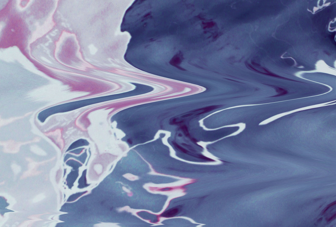
Even though I experimented using foil, I keep on getting drawn back to the images of the reflections that I inverted on photoshop. I think the strongest image of the abstract reflections created is the one below of the reflection of a boat in the harbour I went to. I put the image back on photoshop and I quite liked how the original image looks as you can see the original colours which were created. However, I also really like the inverted image as it makes the image even more abstract. In the inverted image, there are distorted lines and the blue tones in the image make it look like I have placed the image in bleach and physically distorted it. Even though I edited this image in photoshop previously, I wanted the colours to be more sharp and clear, so I decided to edit it again using the same techniques like before. Also, when I edited this image last time, I cropped the image quite a lot but this time I didn't crop it as much because I realised that having the whole image shows the different shapes and colours the reflection created.
Final Pieces